

The U.S. stock market is more than a collection of tickers and price charts—it is a real-time reflection of economic strength, corporate performance, investor psychology, and global capital flows. Every trading day, billions of dollars move based on expectations about inflation, interest rates, earnings growth, geopolitical developments, and technological innovation.
In today’s environment, market direction is shaped by a powerful combination of forces:
- Federal Reserve policy and interest rate expectations
- Inflation trends and labor market strength
- Corporate earnings performance and valuation levels
- Institutional capital flows and retail participation
- Global risks and commodity price movements
- Technological disruption, particularly artificial intelligence
Understanding the U.S. stock market requires connecting these moving parts into a single framework. Headlines may focus on daily volatility, but sustained market trends emerge from structural shifts in liquidity, productivity, and profitability.
Markets are forward-looking. They do not wait for economic data to confirm change—they price expectations in advance. This is why inflation momentum can matter more than inflation levels, and why earnings guidance can outweigh reported results. It is also why investor sentiment, technical structure, and capital positioning often reveal turning points before fundamentals fully shift.
This comprehensive outlook is designed to provide a complete roadmap:
- Where the market stands today
- What economic signals are driving the direction
- How corporate earnings and valuations shape opportunity
- What risks could trigger correction
- Why a bullish expansion scenario remains possible
- How short-term traders and long-term investors should position themselves
Whether you are a daily trader navigating volatility or a long-term investor building wealth for the next decade, understanding the interaction between macroeconomics, corporate performance, and market psychology is essential.
The U.S. market has historically rewarded disciplined investors who combine data-driven analysis with strategic risk management. But success does not come from reacting emotionally to headlines—it comes from understanding the structure behind the moves.
The pages ahead will break down that structure in detail, providing a balanced, forward-looking framework to navigate 2026 and beyond with clarity, discipline, and confidence.
1. Understanding the Current U.S. Stock Market Landscape
The U.S. stock market landscape is not just a collection of price charts—it is a real-time reflection of economic strength, corporate confidence, investor psychology, and global capital movement. Before forming any bullish or bearish opinion, investors must understand the structural condition of the market.
This section breaks down index performance, sector rotation, and sentiment signals in a way that connects price action with underlying economic forces. When you combine these elements, you move from guessing the market’s direction to understanding it.
1.1 Snapshot of Major Index Performance
A serious market outlook always begins with the four core U.S. indices because they represent different segments of the economy.
- S&P 500 – Represents 500 large-cap U.S. companies and acts as the primary benchmark for institutional investors.
- Dow Jones Industrial Average – Tracks 30 major blue-chip corporations, often reflecting traditional industrial strength.
- Nasdaq Composite – Heavy in technology and growth stocks, highly sensitive to interest rate changes.
- Russell 2000 – Focuses on small-cap companies, offering insight into domestic economic strength.
U.S. Stock Market: Daily, Weekly, Monthly, and YTD Performance
To make this section powerful, include:
- Daily percentage move (risk-on or risk-off signal)
- Weekly trend (momentum direction)
- Monthly performance (swing bias)
- Year-to-date return (structural strength)
Explain how divergence matters.
For example:
- If Nasdaq is outperforming while Russell 2000 lags → growth concentration risk.
- If small caps outperform → domestic economic optimism.
- If Dow leads → defensive or dividend rotation.
U.S. Stock Market Breadth: The Hidden Strength Indicator
Price alone can mislead investors. Breadth tells the truth.
Include:
- Advancers vs Decliners ratio
- Percentage of stocks above 50-day and 200-day moving averages
- New highs vs new lows
If indices rise but breadth weakens, it suggests concentration risk.
If breadth expands, the rally has durability.
Professional investors watch breadth before they increase exposure.
52-Week Highs and Lows
This data reveals structural strength.
- Rising 52-week highs → strong bull phase
- Expanding 52-week lows → early warning of correction
- Simultaneous expansion in both → volatile distribution phase
Highlight historical comparison. For example:
During strong bull cycles, 52-week highs consistently outnumber lows by 3:1 or more.
U.S. Stock Market Volume Trends: Institutional Footprint
Volume confirms conviction.
Include:
- Average daily volume vs 30-day average
- Accumulation days vs distribution days
- Volume spikes on breakouts
If price rises on low volume → weak participation.
If price rises on heavy volume → institutional buying.
Remind: retail traders move prices temporarily, institutions move markets structurally.
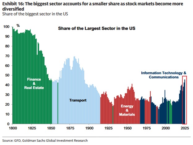
1.2 Sector Rotation and Capital Flow Trends
Markets do not rise evenly. Capital rotates between sectors based on economic expectations, interest rates, and earnings outlook.
The 11 S&P sectors to analyze:
- Technology
- Financials
- Healthcare
- Consumer Discretionary
- Consumer Staples
- Energy
- Industrials
- Materials
- Utilities
- Real Estate
- Communication Services
Identifying Outperformers and Underperformers
Show a table comparing:
- 1-week performance
- 1-month performance
- YTD performance
- Relative strength vs S&P 500
Explain what leadership means.
For example:
- Tech + Communication Services leading → AI or innovation-driven rally
- Energy leading → inflation or oil price pressure
- Utilities and Staples leading → defensive positioning
Sector leadership tells you what the market expects next.
U.S. Stock Market: ETF Flow Analysis
Track capital using major ETFs:
- SPY (S&P 500 exposure)
- QQQ (Nasdaq 100 exposure)
- IWM (Small-cap exposure)
- XLF (Financial sector)
- XLK (Technology sector)
Include:
- Net inflows/outflows
- Weekly fund flow changes
- Institutional positioning shifts
Heavy inflows into QQQ while SPY stagnates show narrow growth dominance.
Strong inflows into IWM (Small-cap exposure) signal improving economic confidence.
ETF flows are one of the clearest real-time indicators of money movement.
Defensive vs Cyclical Rotation
Explain:
Cyclical sectors:
- Technology
- Industrials
- Consumer Discretionary
- Financials
Defensive sectors:
- Utilities
- Consumer Staples
- Healthcare
If defensives outperform → risk-off environment.
If cyclicals outperform → expansion phase.
This part connects economic data with price behavior.
Growth vs Value Performance Gap
Measure:
- Growth ETF vs Value ETF performance
- Forward P/E premium
- Earnings growth differential
When growth dramatically outperforms value, valuations expand.
When value outperforms, markets are repositioning for stability or rate shifts.
1.3 Market Sentiment Indicators
Markets move not only on data, but on psychology.
Understanding sentiment helps predict turning points before they appear in price.
VIX Levels – The Fear Gauge
The CBOE Volatility Index (VIX) measures expected volatility.
General interpretation:
- Below 15 → complacency
- 15–20 → stable optimism
- 20–30 → elevated uncertainty
- Above 30 → panic phase
Low VIX during record highs may signal complacency risk.
Spiking VIX during pullbacks often creates buying opportunities.
Context is everything.
Put/Call Ratio
Measures options positioning.
- High ratio → excessive fear
- Low ratio → excessive optimism
Extremes often signal reversals.
Professional traders use this as a contrarian indicator.

CNN Fear & Greed Index
U.S. Stock Market: Break down its components:
- Momentum
- Stock price strength
- Breadth
- Options activity
- Junk bond demand
- Safe-haven demand
Explain that extreme greed near market highs can precede pullbacks.
Extreme fear during corrections often marks bottoms.
Retail vs Institutional Positioning
Include:
- Margin debt levels
- 13F institutional filings
- Hedge fund net exposure
- Dark pool activity
When retail aggressively buys while institutions reduce exposure, risk increases.
When institutions accumulate quietly during fear, opportunity emerges.
AAII Sentiment Survey
This weekly survey measures:
- Bullish percentage
- Bearish percentage
- Neutral positioning
Historical extremes:
- 50% bullish → overheated
- 45% bearish → potential bottom zone
These explain that markets often reverse when crowd consensus becomes one-sided.
2. Key Economic Signals Driving the Market
If price action tells you what the market is doing, economic signals tell you why.
Institutional investors do not allocate billions based on headlines—they react to monetary policy, inflation trajectories, labor conditions, and growth momentum.
Understanding these signals allows readers to interpret daily volatility within a broader structural framework. This section connects Federal Reserve policy, inflation trends, employment strength, and GDP growth directly to equity performance—because every major bull market and every major correction in U.S. history has been shaped by these forces.
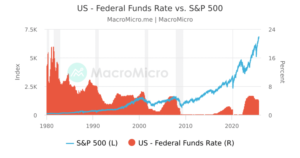
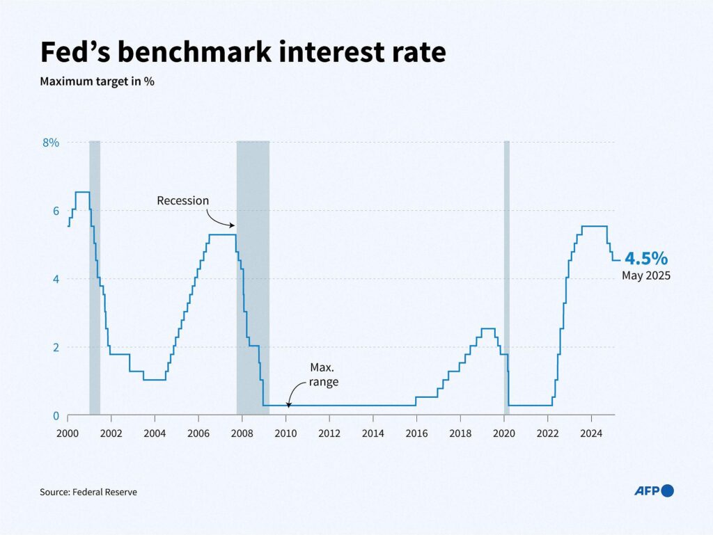
2.1 Federal Reserve Policy and Interest Rate Outlook
No single institution has more influence over U.S. equity markets than the Federal Reserve. Interest rates determine borrowing costs, corporate profitability, valuation multiples, liquidity conditions, and investor risk appetite.
Current Federal Funds Rate
Start by clearly stating:
- The current Fed Funds target range
- How it compares to the past 5–10 years
- Whether the policy is restrictive, neutral, or accommodative
Then explain why this matters:
Higher rates:
- Compress equity valuations (especially growth stocks)
- Increase bond yields, making fixed income more attractive
- Raise corporate borrowing costs
Lower rates:
- Expand P/E multiples
- Boost risk appetite
- Encourage leverage and capital investment
Context is critical. A 5% rate means something very different in a high-growth environment versus a slowing economy.
U.S. Stock Market: Dot Plot Expectations
The Fed’s “dot plot” reveals where policymakers expect rates to move in the coming years.
In your analysis, include:
- Median rate projection for the current year
- Projections for the next 2–3 years
- Long-run neutral rate estimate
Then explain divergence:
- If markets expect aggressive cuts but the dot plot signals fewer cuts → volatility risk.
- If markets are overly pessimistic and the Fed signals easing → upside catalyst.
Highlight how forward expectations drive markets more than current rates.
Commentary from the Federal Reserve
Summarize tone from official statements:
- Hawkish language → inflation concerns remain.
- Dovish language → growth risks rising.
- Data-dependent language → flexibility, but uncertainty.
Investors often react more to tone than policy itself.
Explain how subtle wording changes (for example, replacing “ongoing tightening” with “monitoring conditions”) can shift billions in capital flows within minutes.
Statements from Jerome Powell
The Fed Chair’s press conferences often move markets dramatically.
In this subsection:
Key Themes from Recent Federal Reserve Speeches
Recent speeches from Jerome Powell and other officials at the Federal Reserve have revolved around three dominant themes:
1. “Higher for Longer” Policy Bias
Officials have repeatedly emphasized that inflation remains above target and that policy must stay restrictive until there is sustained evidence of price stability. The phrase “premature easing” has appeared multiple times in commentary, reinforcing the idea that the Fed does not want to repeat the 1970s mistake of cutting rates too early.
2. Data-Dependent Decision Framework
Powell has consistently stated that future rate decisions will depend on incoming economic data, particularly inflation and labor market conditions. This shifts focus from fixed forward guidance to flexible response—making every CPI, payroll, and PCE release a potential volatility trigger.
3. Balancing Inflation Risk vs. Economic Slowdown
Recent remarks increasingly acknowledge the risk of overtightening. While inflation control remains the priority, officials have begun referencing “two-sided risks”—suggesting awareness that excessive restriction could weaken growth more than intended.
These themes collectively signal a Fed that is cautious, vigilant, and unwilling to declare victory prematurely.
Consistency vs. Shift in Messaging
A deeper analysis reveals subtle but important shifts.
Earlier Phase (Hawkish Emphasis):
- Strong focus on inflation persistence
- Minimal concern about growth slowdown
- Repeated commitment to further tightening
Recent Phase (Balanced Tone):
- Greater acknowledgment of cooling inflation trends
- Increased reference to lagged effects of policy
- Recognition that real rates are already restrictive
The shift is not dramatic, but tone matters.
Markets react to nuance:
- Replacing “additional hikes likely” with “prepared to adjust if necessary.”
- Acknowledging “disinflation progress.”
- Referencing improving supply chains
These incremental adjustments often signal that the tightening cycle is maturing—even if no official pivot has been announced.
Professional investors monitor language changes word by word because policy inflection points are usually communicated subtly before they are executed formally.
How Markets Responded Intraday
Intraday reactions to Powell’s speeches often follow a predictable pattern:
Phase 1: Immediate Algorithmic Reaction (First 5–10 Minutes)
High-frequency trading systems scan keywords like:
- “Inflation”
- “Persistent”
- “Restrictive”
- “Easing”
- “Balanced”
If tone appears hawkish:
- Treasury yields spike
- Nasdaq drops sharply
- Dollar strengthens
If tone appears dovish:
- Bond yields fall
- Growth stocks rally
- Small caps outperform
Phase 2: Human Reassessment (Next 1–2 Hours)
Institutional desks reassess the full context:
- Did Powell actually shift policy bias?
- Is this new information or reinforcement of prior guidance?
- Does this change terminal rate expectations?
This second wave often reverses the initial algorithm-driven move.
Phase 3: Closing Session Positioning
Large asset managers adjust positioning before the close:
- Hedging exposure
- Rolling options positions
- Adjusting sector allocation
If the speech signals a prolonged tight policy:
- Defensive sectors outperform
- Utilities and healthcare gain
- Growth underperforms
If the speech hints at policy easing:
- Technology rallies strongly
- Small caps see aggressive buying
- Financial conditions loosen rapidly
Why This Matters for Investors
Fed communication shapes:
- Liquidity expectations
- Valuation multiples
- Risk appetite
- Sector leadership
The most important takeaway:
Markets do not wait for rate cuts—they move on expectations.
The shift in tone often precedes the shift in policy.
By carefully tracking language consistency, subtle tone changes, and real-time market reactions, investors gain a forward-looking edge rather than reacting after the move has already occurred.
Powell’s credibility matters. If markets believe inflation is under control, equities stabilize. If confidence weakens, volatility rises.
Key Themes from Recent Federal Reserve Speeches
Recent speeches from Jerome Powell and other officials at the Federal Reserve reveal a clear and carefully balanced message. While headlines often focus on single phrases, the broader communication strategy shows a central bank that is firm on inflation control but increasingly aware of economic risks.
Three dominant themes stand out.
1. “Higher for Longer” Policy Bias
The Fed continues to emphasize that inflation remains above its 2% target. Powell has repeatedly warned against “premature easing,” signaling that cutting rates too early could reignite inflation pressures—similar to policy mistakes made during the 1970s.
In simple terms, this means:
- The Fed prefers to keep rates elevated longer than markets might expect.
- Officials want sustained proof that inflation is truly under control.
- A single soft inflation report is not enough to trigger policy easing.
For investors, this reinforces the idea that liquidity will not return quickly unless inflation clearly trends lower for several months.
2. Data-Dependent Decision Framework
Powell has consistently described policy decisions as “data dependent.” Instead of committing to a fixed path of hikes or cuts, the Fed now adjusts based on incoming economic information.
This shifts market focus toward:
- CPI (inflation data)
- PCE (the Fed’s preferred inflation gauge)
- Nonfarm payrolls
- Wage growth
Because of this approach, every major economic release becomes a potential volatility catalyst. Markets no longer rely on forward guidance alone—they respond to each data print in real time.
In practical terms, this means:
- Strong inflation data can delay rate cuts.
- Weak labor data can increase easing expectations.
- Mixed data creates uncertainty and higher volatility.
3. Balancing Inflation Risk vs. Economic Slowdown
More recently, speeches have begun acknowledging “two-sided risks.” While inflation remains the primary concern, officials are increasingly recognizing that keeping rates too high for too long could damage economic growth.
This subtle shift does not signal an immediate pivot—but it suggests awareness that policy is already restrictive.
Investors should pay attention to phrases such as:
- “Lagged effects of tightening”
- “Monitoring financial conditions.”
- “Balanced risks”
When these phrases appear more frequently, it often means the tightening cycle is approaching maturity.
Consistency vs. Shift in Messaging
To understand the full picture, it helps to compare earlier speeches with more recent ones.
Earlier Phase: Strongly Hawkish
In the earlier stage of the tightening cycle, communication was clear and firm:
- Heavy emphasis on persistent inflation.
- Little discussion of growth risks.
- Repeated commitment to further rate increases.
The goal at that time was credibility—convincing markets that inflation control was non-negotiable.
Recent Phase: More Balanced Tone
More recent remarks reflect subtle adjustments:
- Greater acknowledgment of moderating inflation trends.
- Increased discussion of the delayed impact of past rate hikes.
- Recognition that real interest rates are already restrictive.
The shift is not dramatic—but tone matters greatly in financial markets.
Replacing “additional hikes likely” with “prepared to adjust if necessary” may seem minor. However, to institutional investors, such language often signals that policy tightening is nearing its end—even if no formal pivot has been announced.
Professional investors analyze Fed communication word by word because major policy turning points are usually hinted at before they are officially declared.
How Markets Responded Intraday
Market reactions to Powell’s speeches typically unfold in three stages.
Phase 1: Immediate Algorithmic Reaction (First 5–10 Minutes)
High-frequency trading systems instantly scan for key terms such as:
- “Inflation”
- “Persistent”
- “Restrictive”
- “Easing”
- “Balanced”
If the tone appears hawkish:
- Treasury yields rise sharply.
- The Nasdaq Composite often falls quickly.
- The U.S. dollar strengthens.
If the tone appears dovish:
- Bond yields decline.
- Growth stocks rally.
- Small-cap stocks outperform.
This initial move is often fast and exaggerated because it is driven by automated systems.
Phase 2: Institutional Reassessment (Next 1–2 Hours)
After the initial reaction, human traders and institutional desks reassess:
- Did Powell truly change policy direction?
- Was the language new or consistent with previous guidance?
- Does this alter expectations for the terminal rate?
This second phase sometimes reverses the early move if the market overreacted to isolated wording.
Phase 3: Closing Positioning
Before the market closes, large asset managers adjust exposure based on the broader interpretation.
If the speech signals a prolonged tight policy:
- Defensive sectors such as utilities and healthcare tend to outperform.
- High-growth technology may lag.
- Bond yields remain elevated.
If the speech hints at easing:
- Technology and cyclical stocks often rally.
- Small caps may gain momentum.
- Financial conditions loosen as yields decline.
This closing session behavior often reveals how seriously institutional investors interpret the message.
Why This Matters for Investors
Federal Reserve communication directly influences:
- Liquidity conditions
- Valuation multiples
- Risk appetite
- Sector leadership
The most important lesson for readers is this:
Markets do not wait for actual rate cuts—they move on expectations.
Often, equity markets begin rallying months before the first rate cut if investors believe easing is coming. Conversely, markets can decline even without new hikes if investors fear rates will remain elevated longer than expected.
By tracking consistency, tone shifts, and real-time market reactions, investors gain a forward-looking advantage. Instead of reacting after policy changes are official, they position themselves ahead of them.
Understanding Fed communication is not about predicting exact rate moves. It is about recognizing when the narrative begins to change—because that is when markets usually begin to move.
Rate Cut / Hike Probabilities
Understanding where interest rates are today is important.
Understanding where markets believe rates are heading is far more powerful.
Equity markets are forward-looking. Prices move based on expectations, not current policy. That is why tracking rate cut and hike probabilities is essential for any serious market outlook.
CME FedWatch Probabilities
The most widely followed tool for rate expectations is the CME FedWatch Tool. It calculates the probability of future rate changes based on federal funds futures contracts.
In simple terms, it shows:
- The percentage chance of a rate cut at the next meeting
- The probability of rates staying unchanged
- The likelihood of multiple cuts or hikes over coming meetings
For example:
- If markets price a 70% probability of a rate cut in three months, equities may rally even before the cut happens.
- If probabilities shift suddenly from 60% chance of cuts to 30%, volatility can increase immediately.
These probabilities update in real time as bond traders reposition.
The key insight:
Markets do not wait for the Federal Reserve to act—they react to changes in probability.
Market-Implied Rate Expectations
Beyond individual meeting probabilities, investors track:
- Terminal rate expectations (the highest rate in the cycle)
- Total cuts priced in over the next 6–12 months
- Forward curve expectations
If markets expect:
- 4 rate cuts next year → growth stocks often outperform.
- Fewer cuts than previously priced → yields rise and equities may pull back.
When expectations shift, valuation models adjust quickly.
Lower expected rates increase the present value of future earnings—boosting stock prices, especially for high-growth companies.
This is why a single inflation report can change billions in market capitalization within hours.
Bond Market Yield Curve Interpretation
The yield curve is one of the clearest signals of rate expectations.
It compares yields on short-term bonds (2-year Treasury) with long-term bonds (10-year Treasury).
Three major scenarios matter:
- Inverted Yield Curve (2-year > 10-year)
- Signals expectations of slowing growth or future rate cuts
- Historically precedes recessions
- Often pressures financial stocks
- Steepening Yield Curve (10-year rising faster than 2-year)
- Suggests improving growth outlook
- Supports financial sector earnings
- Indicates easing recession fears
- Bull Steepening (Short-term yields falling faster than long-term)
- Usually happens when markets anticipate aggressive rate cuts
- Often boosts growth sectors
The bond market often predicts economic turning points before stock markets fully react.
How Rate Expectations Affect Sectors Differently
Interest rate expectations do not impact all sectors equally. This is where macro policy connects directly to sector rotation.
Technology – Highly Sensitive to Rate Expectations
Technology stocks depend heavily on future earnings growth.
When rates fall:
- Future profits are discounted at a lower rate.
- Valuations expand.
- Growth stocks rally strongly.
When rates rise or cuts are delayed:
- Valuation multiples compress.
- Nasdaq often underperforms.
This is why the Nasdaq Composite tends to react more aggressively than other indices during Fed-driven volatility.
Financials – Benefit from a Steep Yield Curve
Banks and financial institutions profit from the spread between short-term and long-term rates.
If the yield curve steepens:
- Banks can borrow short-term at lower rates.
- Lend long-term at higher rates.
- Net interest margins improve.
If the curve inverts:
- Profitability pressure increases.
- Lending slows.
- Financial stocks often underperform.
Thus, expectations of rate cuts that steepen the curve can benefit financials—if growth remains stable.
Utilities – Sensitive to Bond Competition
Utilities are often treated like bond substitutes because:
- They pay steady dividends.
- They offer stable earnings.
When bond yields rise:
- Investors may prefer safer Treasuries.
- Utilities can underperform.
When yields fall:
- Dividend-paying utilities become more attractive.
- Capital rotates back into defensive sectors.
Utilities often outperform in falling rate environments combined with economic uncertainty.
Why This Section Matters
Rate expectations drive:
- Valuation multiples
- Sector leadership
- Capital flows
- Risk appetite
Even before the Federal Reserve officially cuts or hikes rates, shifts in probabilities reshape portfolios across Wall Street.
By analyzing:
- CME FedWatch data
- Market-implied rate paths
- Yield curve behavior
You connect macro policy directly to sector rotation and index performance.
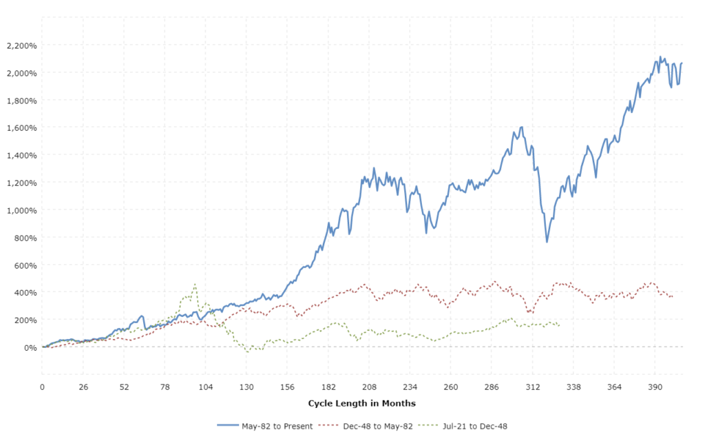
Historical Impact on Equities
To truly understand how monetary policy shapes the stock market, investors must look beyond short-term headlines and study history. Every major bull market and every major correction in modern financial history has been influenced by interest rate cycles driven by the Federal Reserve.
The relationship between rates and equities follows clear historical patterns. While each cycle is unique, the structure of market reactions tends to repeat.
1. Rate Hiking Cycles Typically Compress Valuations
When the Federal Reserve raises interest rates, the cost of money increases across the economy. Borrowing becomes more expensive, liquidity tightens, and financial conditions become restrictive.
For equities, this primarily affects valuation multiples.
Stock prices are based on the present value of future earnings. When rates rise:
- The discount rate applied to future cash flows increases.
- The present value of long-term earnings decreases.
- Price-to-earnings (P/E) ratios contract.
This is why growth stocks—especially in technology—often underperform during aggressive hiking cycles. Their valuations depend heavily on profits expected years into the future.
Historical examples show:
- During the 2018 tightening cycle, equity multiples contracted sharply.
- In 2022, rapid rate hikes led to one of the fastest valuation compressions in decades, particularly in high-growth sectors.
It is important to understand:
Markets do not decline only because earnings fall. Often, they decline because valuations compress while earnings remain stable.
2. Early Easing Cycles Often Coincide with Economic Stress
Many investors assume that rate cuts are automatically bullish. History shows the reality is more nuanced.
In several cycles, the first rate cut occurred not during economic strength, but during emerging weakness.
For example:
- The Fed began cutting rates in 2001 as the economy entered recession.
- In 2007, cuts started as financial stress intensified.
- In early 2020, emergency cuts followed severe economic disruption.
In these situations:
- Markets may initially fall despite rate cuts.
- Investors worry that the Fed is responding to deeper economic problems.
- Earnings expectations decline rapidly.
Early cuts often signal that economic conditions have deteriorated enough to require policy support.
This is why understanding why the Fed is cutting matters more than the cut itself.

3. Markets Tend to Rally Before the First Rate Cut If Inflation Is Falling
One of the most important historical patterns is this:
Equities often begin rallying months before the first official rate cut—provided inflation is clearly trending lower.
Why?
Because markets are forward-looking.
If investors believe:
- Inflation is under control,
- Rate hikes are finished,
- Policy easing is coming,
They begin positioning ahead of the policy shift.
The rally often begins when:
- Bond yields peak.
- Rate hike probabilities collapse.
- Economic data stabilizes, even if still weak.
By the time the first rate cut is announced, a significant portion of the rally may already have occurred.
This pattern reflects anticipation, not reaction.
Equities Are Forward-Looking
The stock market typically bottoms before economic data improves.
Historically:
- Markets bottomed in March 2009, while unemployment continued rising for months afterward.
- Markets began recovering in late 2022 before inflation had fully returned to target.
- In prior recessions, equity indices turned upward several months before GDP growth resumed.
This happens because:
Markets price expectations of future earnings, not current conditions.
If investors believe:
- The worst is over,
- Policy tightening has ended,
- Liquidity conditions will improve,
They begin buying before the economic data confirms recovery.
By the time headlines turn positive, the opportunity is often partially priced in.
Why Policy Expectations Matter More Than Current Headlines
Daily headlines focus on:
- Current inflation prints
- Current unemployment rates
- Current GDP data
But markets focus on trajectory.
Is inflation accelerating or decelerating?
Are rate expectations rising or falling?
Is the yield curve stabilizing or worsening?
Shifts in expectations drive:
- Bond yields
- Valuation multiples
- Sector leadership
- Risk appetite
This is why a single speech from Jerome Powell can move markets more than a confirmed economic report.
The market moves when the narrative changes—not when the data confirms what everyone already knows.
The Core Insight for Investors
Understanding interest rate cycles is not about predicting the exact date of the next Federal Reserve decision. It is about understanding how policy shifts reshape valuations, liquidity, and investor psychology.
When you step back and study history, four powerful truths consistently emerge.
Hiking Cycles Pressure Valuations
When the Federal Reserve raises interest rates, the impact is not limited to borrowing costs. It changes how investors calculate the value of future earnings.
Higher rates mean:
- Future profits are discounted at a higher rate.
- Valuation multiples contract.
- Risk assets face tighter financial conditions.
Even if corporate earnings remain stable, stock prices can decline simply because the market is no longer willing to pay the same premium for growth.
This is why rate-hiking cycles often lead to:
- Lower price-to-earnings ratios
- Increased volatility
- Greater selectivity in sector performance
The pressure begins not when rates peak—but when investors believe they will continue rising.
Early Cuts Can Signal Stress
Rate cuts are often misunderstood as automatically bullish. In reality, the first cut frequently occurs because economic stress is emerging.
Historically, early easing phases have coincided with:
- Slowing economic growth
- Rising unemployment
- Credit market strain
When the Fed cuts aggressively, it can signal that conditions have deteriorated enough to require intervention.
Markets may initially react positively, but if earnings expectations are falling at the same time, equity gains can be limited or volatile.
The context behind the cut matters more than the cut itself.
Markets Often Rally Before Policy Officially Shifts
One of the most important patterns in financial history is this:
Markets move in anticipation.
Equities frequently begin rising:
- Before the first rate cut
- Before inflation returns fully to target
- Before the economic data clearly improves
Why?
Because markets price the future, not the present.
If investors believe inflation is declining and the tightening cycle is ending, capital begins flowing back into equities ahead of official confirmation.
By the time policy actually changes, much of the move may already be underway.
This forward-looking behavior explains why market bottoms often occur while economic headlines still look negative.
Expectations Drive Prices More Than Current Data
Financial markets are expectation machines.
A strong inflation report may not hurt stocks if investors expected worse.
A moderate jobs report can cause volatility if markets were pricing stronger growth.
Prices adjust to surprises—not simply to numbers.
This is why:
- Changes in rate cut probabilities move markets instantly.
- Subtle language shifts from Jerome Powell can trigger intraday volatility.
- Bond yield movements often precede equity direction.
Investors who focus only on current data risk reacting too late. Those who monitor shifts in expectations gain an advantage.
The Strategic Takeaway
Successful investing during rate cycles requires understanding the sequence:
- Inflation trends shift.
- Rate expectations adjust.
- Bond yields react.
- Valuations reprice.
- Sector leadership changes.
By the time headlines confirm the shift, markets have already moved.
The core insight is simple but powerful:
It is not the policy action itself that drives equities—it is the change in expectations about future policy.
Investors who track that change position themselves ahead of the crowd rather than behind it.
2.2 Inflation Trends (CPI, PPI, Core Inflation)
Inflation is the central driver of Federal Reserve policy. When inflation accelerates, tightening follows. When inflation moderates, easing becomes possible.
Understanding inflation components helps investors anticipate policy shifts before they occur.
Latest CPI Data
The Consumer Price Index (CPI) is one of the most influential economic reports in global financial markets. Released monthly, it measures the change in prices paid by consumers for goods and services—and it directly shapes expectations for Federal Reserve policy, bond yields, and equity valuations.
Serious investors do not just look at the headline number. They analyze CPI through three key lenses: month-over-month change, year-over-year change, and the multi-month trend.
Month-over-Month Change
The month-over-month (MoM) figure shows how much prices increased or decreased compared to the previous month.
This is the most sensitive measure because it reflects the most recent momentum in inflation.
For example:
- A 0.2% monthly increase suggests moderate price pressure.
- A 0.4% or higher monthly reading can signal re-acceleration.
- A 0.1% or flat reading may indicate cooling momentum.
Why this matters:
If inflation runs at 0.4% per month consistently, that annualizes to nearly 5%—well above the Federal Reserve’s 2% target. Even if the year-over-year number looks stable, accelerating monthly readings can alarm policymakers and markets.
Markets react quickly to MoM data because it signals whether inflation is gaining or losing speed right now—not six months ago.
Year-over-Year Change
The year-over-year (YoY) figure compares current prices to the same month one year earlier.
This is the most widely cited number in media coverage because it reflects the broader inflation environment.
However, YoY data has a lag effect:
- It can fall simply because high readings from the prior year are dropping out of the calculation.
- It may not fully reflect recent acceleration or deceleration.
For example:
- If YoY inflation falls from 4% to 3%, that appears positive.
- But if the last three monthly readings were accelerating, the improvement may be temporary.
Serious analysis compares both MoM and YoY to determine whether the headline decline is structurally meaningful or mathematically driven by base effects.
Trend Direction Over the Past Six Months
Single reports can mislead. Trend analysis provides clarity.
Investors should examine:
- Is the three-month average rising or falling?
- Is the six-month annualized rate above or below the Fed’s target?
- Are core components consistently cooling?
If the six-month trend shows steady moderation, markets gain confidence that inflation is moving sustainably toward the target.
If inflation fluctuates unpredictably—one soft report followed by a hot report—it creates uncertainty, which increases volatility.
Consistency builds market confidence. Instability increases risk premiums.
Is Inflation Re-Accelerating, Stabilizing, or Declining?
After reviewing the data, investors must classify the inflation environment.
Re-Accelerating Inflation
Signals:
- Rising month-over-month readings for consecutive months.
- Core inflation is trending higher.
- Sticky services inflation.
Implications:
- Rate cut expectations decrease.
- Bond yields rise.
- Growth stocks often face valuation pressure.
- Volatility increases.
Markets fear that the Federal Reserve may need to maintain restrictive policy longer than expected.
Stabilizing Inflation
Signals:
- MoM readings are fluctuating but not trending upward.
- YoY is gradually drifting lower.
- Core measures steady.
Implications:
- Rate expectations remain stable.
- Market volatility moderates.
- Sector leadership becomes more balanced.
This environment often supports range-bound equity markets rather than strong directional moves.
Consistently Declining Inflation
Signals:
- Multiple months of subdued MoM increases.
- Six-month annualized inflation is trending toward 2%.
- Broad-based cooling across goods and services.
Implications:
- Rate cut probabilities increase.
- Bond yields decline.
- Equity valuations expand.
- Risk appetite improves.
This is the most supportive scenario for sustained equity rallies—provided economic growth remains intact.
Why Markets React to Surprises, Not Just Numbers
One of the most misunderstood aspects of CPI reactions is this:
Markets move based on expectations versus reality—not absolute levels.
For example:
- If inflation comes in at 3%, but markets expected 3.3%, equities may rally.
- If inflation prints 2.8%, but expectations were 2.5%, stocks may fall.
The key driver is the “surprise factor.”
Bond traders, equity investors, and algorithmic systems compare actual data with consensus forecasts within seconds. If inflation is hotter than expected:
- Treasury yields spike.
- Rate cut probabilities decline.
- High-growth stocks sell off.
If inflation is cooler than expected:
- Yields fall.
- Risk assets rally.
- Financial conditions ease.
The magnitude of the surprise often matters more than the level itself.
The Bigger Strategic Picture
CPI data influences:
- Federal Reserve rate expectations
- Bond market positioning
- Sector rotation
- Equity valuation multiples
But the most important insight is this:
Markets do not react to inflation—they react to changes in inflation momentum and shifts in expectations.
If inflation is clearly trending lower and surprises are consistently soft, equities typically benefit even before official rate cuts begin.
If inflation shows signs of re-acceleration, markets quickly adjust for tighter policy—often before the Federal Reserve formally responds.
Understanding CPI analysis at this structural level allows investors to interpret market moves intelligently rather than emotionally.
Core vs Headline Inflation
To understand inflation properly, investors must distinguish between headline CPI and core CPI. Both numbers are released together, but they tell very different stories about the economy.
Markets often react within seconds of the CPI release—but professional investors look beyond the headline figure to understand what is truly happening beneath the surface.
What Is Headline CPI?
Headline CPI measures the total change in consumer prices across the economy. It includes all major categories of goods and services, including:
- Food
- Energy
Because it captures everything consumers pay for, headline CPI reflects the real-world cost pressures households experience.
If gasoline prices surge or grocery costs jump sharply, headline CPI will move higher—even if other components remain stable.
Headline CPI is important because:
- It affects consumer sentiment.
- It influences political and social discussions.
- It directly impacts household budgets.
However, it can be highly volatile month to month.
What Is Core CPI?
Core CPI removes the most volatile components:
- Food
- Energy
The reason for excluding these categories is simple: they fluctuate frequently due to factors outside monetary policy control, such as:
- Oil supply disruptions
- Weather conditions
- Geopolitical tensions
- Agricultural output swings
By excluding food and energy, core CPI aims to measure the underlying, persistent inflation trend across housing, services, healthcare, transportation, and other categories.
Core inflation typically moves more slowly and is less influenced by temporary shocks.
Why the Federal Reserve Focuses on Core Inflation
The Federal Reserve places greater emphasis on core measures because monetary policy works with a lag and cannot quickly offset short-term commodity swings.
There are two key reasons:
1. Core Better Reflects Underlying Inflation Trends
Core inflation shows whether pricing pressure is broad-based and persistent.
If core inflation is rising:
- Businesses are passing on higher costs.
- Wage growth may be fueling service inflation.
- Price increases are spreading across multiple sectors.
This type of inflation is harder to reverse and requires sustained policy action.
If core inflation is steadily declining:
- Disinflation is becoming embedded.
- Rate cuts become more plausible.
- Market confidence improves.
For policymakers, the durability of inflation matters more than short-term spikes.
2. Energy Spikes Can Distort Short-Term Data
Energy prices can swing sharply due to global events.
For example:
- Oil production cuts can lift gasoline prices.
- Natural disasters can disrupt supply chains.
- Geopolitical tensions can drive crude oil higher overnight.
These movements can temporarily push headline CPI higher—even if underlying inflation is stable or falling.
If policymakers reacted aggressively to every oil-driven spike, monetary policy would become unstable.
Core CPI helps filter out these distortions and focus on sustained price trends.
The Market Impact: When Headline and Core Diverge
The most important insight for investors is what happens when headline and core move in different directions.
Scenario 1: Headline Falls, Core Remains Sticky
This is one of the most challenging environments.
If gasoline prices decline and headline inflation drops, headlines may look positive. However, if core inflation remains elevated—particularly in services and shelter—policymakers may remain cautious.
In this case:
- Rate cut expectations may not increase significantly.
- Bond yields may remain elevated.
- Equity markets may struggle to sustain rallies.
Markets quickly realize that surface-level improvement does not necessarily mean policy relief.
Scenario 2: Both Headline and Core Decline Consistently
This is the most supportive scenario for equities.
When both measures show sustained moderation:
- Rate cut probabilities rise.
- Bond yields typically decline.
- Valuation multiples expand.
- Risk appetite improves.
Confidence grows that inflation is structurally under control.
Scenario 3: Headline Rises Due to Energy, Core Stable
If headline inflation rises because of oil prices but core remains stable:
- Markets may initially react negatively.
- However, bond markets often stabilize if core trends remain contained.
- Volatility may fade quickly.
Investors differentiate between temporary commodity shocks and structural inflation pressure.
The Strategic Takeaway
Headline CPI reflects what consumers feel.
Core CPI reflects what policymakers act on.
The Federal Reserve prioritizes core trends because they indicate whether inflation is embedded across the economy.
For investors, the key is not just whether inflation is high—but whether it is broad-based, persistent, and accelerating.
When core inflation shows consistent improvement, financial conditions can ease—even if headline numbers fluctuate.
When core remains stubbornly elevated, restrictive policy may persist longer than markets initially expect.
Understanding the distinction between headline and core inflation allows investors to interpret CPI releases with clarity rather than emotion—and that clarity often determines who reacts wisely and who reacts too late.
PCE Index
The Personal Consumption Expenditures (PCE) index is the Federal Reserve’s most closely watched measure of inflation. While headlines often focus on CPI, policymakers at the Federal Reserve rely more heavily on PCE—especially Core PCE—when determining interest rate decisions.
For serious investors, understanding PCE is critical because it shapes rate expectations, bond yields, and ultimately equity valuations.
What Is the PCE Index?
The PCE index measures changes in prices paid by consumers for goods and services. It is published monthly as part of the Bureau of Economic Analysis report and provides a broader and more flexible inflation measure compared to CPI.
Unlike CPI, PCE:
- Adjusts for changes in consumer behavior (substitution effect).
- Has different weighting methods.
- Typically runs slightly lower than CPI over long periods.
Because of these methodological differences, PCE is often viewed as a smoother and more policy-relevant inflation indicator.
Core PCE Trend
Core PCE excludes food and energy, similar to Core CPI. However, it uses a dynamic weighting system that reflects how consumers actually shift spending when prices change.
For example:
- If beef prices rise sharply, consumers may switch to chicken.
- PCE accounts for this substitution, whereas CPI uses more fixed weights.
This makes Core PCE particularly valuable for policymakers because it reflects real-world spending adjustments.
When analyzing Core PCE, investors should focus on:
- Month-over-month changes
- Year-over-year changes
- Three- and six-month annualized trends
A consistent decline in Core PCE signals that underlying inflation pressure is easing sustainably—not just temporarily.
If Core PCE stalls or re-accelerates, it signals persistent pricing power across the economy.
Comparison with CPI
Although both CPI and PCE measure inflation, there are key differences:
1. Weighting Differences
CPI focuses more heavily on shelter costs.
PCE gives broader weight to healthcare and services.
2. Substitution Effect
PCE accounts for consumer behavior changes when prices shift.
CPI does not adjust as dynamically.
3. Level Differences
Historically, PCE tends to run about 0.2–0.4 percentage points lower than CPI.
Because of these differences, a CPI reading of 3% might correspond to a PCE reading closer to 2.6–2.8%.
Markets watch CPI closely for volatility, but the Fed ultimately bases long-term policy decisions more heavily on PCE trends.
The 2% Target
The Federal Reserve’s official inflation target is 2%, measured using PCE—not CPI.
This distinction is crucial.
When Core PCE is:
- Above 2% and rising → policy remains restrictive.
- Above 2% but declining steadily → markets begin pricing future easing.
- Near 2% and stable → the tightening cycle is likely complete.
The 2% target anchors expectations across financial markets. Bond yields, equity valuations, and currency movements all adjust based on how close PCE is to that threshold.
Why Sustained PCE Decline Supports Equity Rallies
Equity markets respond positively when Core PCE shows sustained moderation toward 2%.
Here’s why:
- Rate cut probabilities increase.
- Bond yields tend to fall.
- Discount rates decline.
- Valuation multiples expand.
When investors gain confidence that inflation is structurally under control, capital flows back into risk assets—particularly growth and cyclical sectors.
Historically, major equity rallies often began once inflation momentum clearly turned downward, even before the first official rate cut.
Markets anticipate policy relief well in advance.
When PCE Remains Elevated
If Core PCE stays elevated—especially above 3%—markets begin to fear prolonged tight policy.
In this scenario:
- Rate cut expectations get pushed further out.
- Treasury yields may rise.
- Growth stocks face valuation pressure.
- Defensive sectors may outperform.
Persistent inflation increases uncertainty about how long restrictive policy must remain in place.
Even if economic growth is stable, elevated PCE keeps financial conditions tight, limiting upside potential for equities.
The Strategic Insight
For investors, PCE is not just another inflation metric—it is the Federal Reserve’s compass.
Markets may react sharply to CPI headlines, but longer-term positioning depends on PCE trajectory.
If Core PCE shows consistent movement toward 2%, equity markets often begin re-rating higher in anticipation of easing conditions.
If PCE stagnates or reverses upward, the path to policy normalization becomes uncertain—raising volatility and compressing valuations.
Understanding the PCE trend allows investors to look beyond daily noise and focus on the structural inflation path that ultimately drives monetary policy and long-term market direction.
Shelter Inflation Trends
Shelter inflation is one of the most powerful drivers of overall inflation in the United States. Within the Consumer Price Index (CPI), shelter typically accounts for roughly one-third of the total basket—making it the single largest component.
Because of its weight, even small changes in shelter costs can significantly influence headline and core inflation readings. For investors tracking macro trends and Federal Reserve policy, understanding shelter dynamics is not optional—it is essential.
Why Shelter Matters So Much
Shelter inflation primarily includes:
- Rent of primary residence
- Owners’ equivalent rent (OER)
- Lodging away from home
Owners’ equivalent rent is especially important. It estimates what homeowners would pay to rent their own home. This makes shelter inflation heavily influenced by rental market trends—even if home prices themselves are slowing.
When shelter inflation rises:
- Core CPI remains elevated.
- The Federal Reserve maintains a restrictive policy.
- Rate cut expectations get delayed.
When shelter inflation declines:
- Core inflation cools more sustainably.
- Policy flexibility increases.
- Equity markets gain confidence.
Because shelter carries so much weight, it often determines whether inflation appears “sticky” or decisively falling.
Rent Growth Data
Real-time rental data from private sources often moves months before official CPI shelter data reflects the change.
Investors should monitor:
- National rent growth rates
- Month-over-month rent increases
- Vacancy rates
- New lease versus renewal lease pricing
When rent growth slows or turns negative in real-time market data, it suggests that shelter inflation will likely ease in upcoming CPI releases.
If rent growth accelerates again:
- Core CPI may remain elevated.
- Rate cut probabilities could decline.
- Bond yields may rise.
Rental market trends act as an early signal for future inflation momentum.
Housing Supply Trends
Housing supply is one of the most important structural forces behind shelter inflation. Because shelter carries the largest weight in CPI, changes in housing availability can significantly influence the overall inflation trajectory.
When supply shifts, inflation eventually shifts with it.
Key Indicators to Monitor
To understand whether housing supply is expanding or tightening, investors should track four primary indicators:
- New housing starts – Measures how many new homes begin construction. Rising starts suggest future supply growth.
- Building permits – A forward-looking signal showing planned construction activity.
- Multifamily construction activity – Critical for rental markets, as apartment supply directly affects rent pricing.
- Apartment completion rates – Shows how quickly new units are entering the market and competing for tenants.
These metrics provide early insight into whether supply pressure will ease or intensify in the months ahead.
If Supply Increases Meaningfully
When construction activity rises, and more units enter the market:
- Competition for tenants increases.
- Landlords lose pricing power.
- Rent growth slows.
- Shelter inflation gradually cools.
In this environment, disinflation becomes more sustainable. As rent pressure declines, core CPI often follows lower with a lag. Markets may begin pricing softer inflation even before official data confirms it.
If Housing Supply Remains Tight
When supply remains constrained due to high mortgage rates, zoning limitations, or reduced construction:
- Rental demand stays elevated.
- Landlords maintain pricing leverage.
- Rent growth persists.
- Shelter inflation remains sticky.
Persistent supply shortages can keep core inflation elevated even if other categories cool.
Why Timing Matters
Housing supply does not impact CPI immediately. Construction takes time, leases renew gradually, and pricing adjustments flow slowly into official inflation data.
However, once supply expansion becomes meaningful, pricing pressure shifts across markets. The cooling effect on inflation may take months—but it is structurally powerful.
Strategic Insight
Housing supply trends are not just a real estate issue—they are a macroeconomic signal.
Expanding supply supports disinflation and increases the probability of policy easing.
Tight supply prolongs inflation persistence and delays rate relief.
Investors who monitor housing supply indicators gain early visibility into future inflation trends—often months before CPI reflects the change.
Mortgage Rate Impact
Mortgage rates sit at the intersection of monetary policy, housing demand, and inflation. Because housing is the largest component of CPI, shifts in mortgage rates ripple through both home prices and rental markets—ultimately influencing shelter inflation.
When Mortgage Rates Rise
Higher mortgage rates tighten financial conditions and reduce affordability.
As rates increase:
- Monthly payments rise sharply.
- Home affordability declines.
- Fewer buyers qualify for loans.
- More households remain in the rental market.
This dynamic increases rental demand, which can keep rent growth firm—even if home sales slow. Strong rental demand supports elevated shelter inflation and can delay broader inflation moderation.
In addition, higher rates often discourage existing homeowners from selling, further limiting housing supply and reinforcing price pressure.
When Mortgage Rates Decline
Lower mortgage rates ease financial pressure and stimulate demand.
As rates fall:
- Monthly payments become more manageable.
- Homeownership becomes more accessible.
- Some renters transition into buyers.
- Rental demand moderates.
Reduced rental pressure can slow rent growth, which eventually cools shelter inflation. At the same time, lower rates often revive housing activity and support construction incentives.
The Construction Link
Mortgage rates also shape builder behavior.
- Rising rates discourage new construction due to weaker demand and higher financing costs.
- Falling rates encourage development as demand improves and financing becomes more attractive.
Because construction decisions take time to materialize into completed housing units, today’s mortgage rate environment influences future housing supply conditions.
The Bigger Macro Picture
Mortgage rates influence:
- Housing demand today
- Rental market pressure
- Future housing supply
- Long-term shelter inflation trends
In short, mortgage rates do not just affect homebuyers—they shape the inflation outlook.
When rates stay high, shelter inflation can remain sticky.
When rates fall sustainably, rent growth and housing pressure often ease over time.
Understanding mortgage rate dynamics provides investors with a forward-looking view of how housing will impact overall inflation and monetary policy.
The Lag Effect: Why Shelter Inflation Moves Slowly
One of the most important aspects of shelter inflation is its lag.
CPI shelter data does not immediately reflect real-time rental market changes. Instead:
- Rental surveys capture existing lease contracts.
- Many leases are renewed annually.
- Price adjustments filter into official data gradually.
As a result, even if market rents decline today, CPI shelter inflation may continue rising for several months before turning lower.
This lag creates an opportunity for forward-looking investors.
If real-time rent data shows clear deceleration, markets may anticipate softer CPI prints ahead—even before official numbers confirm it.
Understanding this timing difference allows investors to position ahead of consensus expectations.
Why Rolling Shelter Inflation Changes Market Expectations
If shelter inflation begins to roll over consistently:
- Core CPI declines more sustainably.
- Core PCE follows with a lag.
- The Federal Reserve gains confidence that inflation is moderating structurally.
- Rate cut probabilities increase.
Equity markets often react positively once investors believe shelter inflation has peaked—even if broader inflation remains slightly above target.
Because shelter is so heavily weighted, its direction often determines whether inflation appears persistent or decisively cooling.
Strategic Insight for Investors
Shelter inflation is not just a housing story—it is a monetary policy story.
When rent growth slows, and supply expands:
- Inflation risk declines.
- Bond yields typically soften.
- Growth stocks benefit from an improved valuation outlook.
When shelter remains sticky:
- Policy stays restrictive.
- Financial conditions tighten.
- Market rallies face resistance.
By tracking rent trends, supply data, and mortgage rate dynamics, investors gain early visibility into the inflation path that will ultimately shape Federal Reserve decisions and equity market direction.
In macro investing, understanding shelter inflation is understanding the core engine behind long-term inflation momentum.
Wage Growth
Wage growth is one of the most important bridges between labor market strength and long-term inflation risk. Strong employment alone does not create inflation—but when wages accelerate persistently, pricing pressure can spread across the economy.
For policymakers at the Federal Reserve, wage trends help determine whether inflation is cooling sustainably or becoming embedded.
Average Hourly Earnings Growth
Average hourly earnings (AHE) measure how quickly workers’ pay is increasing month over month and year over year.
If earnings growth accelerates sharply:
- Businesses face higher labor costs.
- Companies may pass those costs to consumers.
- Services inflation tends to remain sticky.
If wage growth slows gradually:
- Cost pressures ease.
- Inflation risks decline.
- Markets gain confidence in policy normalization.
Investors closely monitor the three- and six-month wage trends, not just one data point.
Real Wage Growth (After Inflation)
Real wages adjust earnings for inflation.
- If wages rise faster than inflation, consumers gain purchasing power.
- If inflation outpaces wages, household budgets tighten.
Positive real wage growth supports consumer spending and economic resilience.
However, if real wage gains are too strong during high inflation, they may sustain demand-driven price pressure.
Balance is key.
Wage-Price Spiral Risk
A wage-price spiral occurs when:
- Workers demand higher pay due to rising prices.
- Businesses raise prices to offset higher wages.
- Inflation expectations become entrenched.
This cycle can make inflation persistent and harder to control.
Historically, the Federal Reserve reacts aggressively if signs of a wage-price spiral emerge.
The Critical Balance
If wages rise faster than productivity, companies must either:
- Accept lower profit margins, or
- Increase prices.
This creates ongoing inflation pressure.
However, if wage growth moderates while employment remains stable:
- Inflation risk declines.
- Economic growth continues.
- The Fed gains flexibility to ease policy.
That balance—strong employment with cooling wage growth—is often described as the ideal “soft landing” scenario.
Strategic Insight
Wage data is not just about paychecks—it signals whether inflation will persist or fade.
Accelerating wages can delay rate cuts.
Moderating wages with stable employment can unlock policy flexibility.
Understanding this nuance allows investors to assess whether labor strength is supportive—or inflationary—and position accordingly.
2.3 Labor Market Strength
The labor market is the backbone of the U.S. economy.
The labor market is the engine of the U.S. economy. Consumer spending represents roughly two-thirds of GDP, and employment stability determines whether households feel confident enough to spend, borrow, and invest.
For markets, labor data influences two critical forces at the same time:
- Economic growth expectations
- Inflation and Federal Reserve policy expectations
Understanding this balance is essential.
Nonfarm Payrolls
The monthly Nonfarm Payrolls report measures how many jobs were added or lost in the economy.
Serious analysis should include:
- Monthly job creation numbers – Are jobs being added at a healthy pace?
- Comparison to expectations – Did the data surprise markets?
- Three-month moving average – Is hiring accelerating or slowing?
Markets respond not just to strength or weakness—but to deviations from forecasts.
Strong payrolls:
- Support economic growth outlook.
- Strengthen consumer spending expectations.
- But can raise inflation fears if wage pressure rises.
Weak payrolls:
- Signal a potential economic slowdown.
- May increase the probability of rate cuts.
- But can hurt corporate earnings expectations.
The ideal scenario for markets is balanced job growth—strong enough to avoid recession, but not so strong that it fuels inflation.
Unemployment Rate
The unemployment rate measures the percentage of the labor force actively seeking work but unable to find it.
Investors should examine:
- Current unemployment level
- Comparison to historical averages
- The Sahm Rule recession indicator (which flags recession risk when unemployment rises sharply from recent lows)
Very low unemployment suggests economic strength—but it can also create wage pressure if labor supply is tight.
Historically, sustained increases in unemployment often precede recessions. Markets closely watch for trend changes rather than single-month spikes.
Participation Rate
The labor force participation rate shows how many working-age individuals are either employed or actively seeking work.
This metric adds depth to unemployment analysis.
If unemployment rises because more people are entering the workforce, that is healthier than unemployment rising due to layoffs.
A stable or rising participation rate suggests:
- Structural resilience
- Improved labor supply
- Reduced wage pressure
Participation trends often determine whether rising unemployment signals expansion or contraction.
Average Hourly Earnings
Wage growth connects labor strength to inflation risk.
If wage growth accelerates:
- Consumer purchasing power increases.
- Demand remains strong.
- Inflation risk may rise if productivity does not keep pace.
If wage growth moderates while employment remains stable:
- Inflation pressure eases.
- The Federal Reserve gains policy flexibility.
- A “soft landing” becomes more achievable.
This dynamic often shapes market narratives following jobs reports.
Jobless Claims Trend
Weekly initial jobless claims provide one of the earliest warning signals of labor weakness.
- Rising claims trend → Early signs of layoffs and potential slowdown.
- Stable or declining claims → Continued labor resilience.
Markets frequently react to inflection points in claims data before larger economic indicators confirm change.
Because claims are released weekly, they offer faster insight than monthly payroll data.
Strategic Takeaway
Labor market data drives both growth expectations and monetary policy direction.
Strong labor supports earnings—but excessive strength may delay rate cuts.
Weak labor increases easing probability—but raises recession concerns.
The market’s preferred environment is equilibrium:
steady job growth, moderating wage pressure, stable participation, and controlled inflation risk.
Understanding these dynamics allows investors to interpret labor data not emotionally—but strategically.
2.4 GDP Growth and Economic Momentum
Gross Domestic Product (GDP) measures the total value of goods and services produced in the economy. But for investors, the level of GDP matters less than its momentum—whether growth is accelerating, stabilizing, or slowing.
Markets price future earnings. And earnings depend on the direction of economic momentum, not just the last reported number.
Latest Quarterly GDP
When analyzing the most recent GDP report, focus on structure—not just the headline growth rate.
Key elements to assess:
- Annualized growth rate – Is the economy expanding above trend, at trend, or below trend?
- Key contributors – How much came from:
- Consumer spending
- Business investment
- Government spending
- Inventory adjustments – Were companies building inventory (temporary boost) or drawing it down?
If GDP is strong because of inventory buildup, growth may slow next quarter.
If GDP is moderate but driven by stable consumer demand and investment, expansion may be more sustainable.
Strong GDP with weakening forward indicators can signal temporary strength.
Moderate GDP with improving forward signals often indicates durable expansion.
Structure matters more than the headline.
Leading Indicators
Leading indicators help investors anticipate turning points before GDP confirms them.
Key measures include:
- Conference Board Leading Economic Index (LEI) – Tracks forward-looking components such as new orders and credit conditions.
- Yield curve slope – Inversions often precede economic slowdowns.
- Manufacturing orders – Signal future production demand.
- Housing starts – Reflect confidence and construction momentum.
Leading indicators typically turn before GDP does.
Persistent declines in these indicators have historically preceded recessions by several months. Markets often react to these signals well before official GDP data reflects the slowdown.
ISM Manufacturing & Services
The ISM surveys measure business activity using a diffusion index:
- Above 50 → Expansion
- Below 50 → Contraction
Manufacturing and services can diverge.
Because services dominate the U.S. economy, the Services PMI carries greater weight in assessing overall growth.
If manufacturing contracts while services remain strong, it may indicate sector rotation rather than a broad recession.
However, if both fall below 50 and trend downward, economic momentum is likely deteriorating.
Consumer Spending Trends
Consumer activity drives the majority of U.S. GDP.
Key indicators include:
- Retail sales growth – Measures spending momentum.
- Credit card spending trends – Reflect near-term consumption patterns.
- Savings rate – Shows financial cushion strength.
- Delinquency levels – Indicate financial stress.
Strong consumer spending supports corporate revenues and earnings growth.
Weakening spending, rising delinquencies, and falling savings rates increase recession risk.
Because consumer behavior shifts before GDP data confirms a change, markets closely track spending trends for early signals.
Strategic Takeaway
GDP confirms where the economy has been.
Leading indicators, PMI data, and consumer trends suggest where it is heading.
Strong momentum supports earnings and equity valuations.
Slowing momentum increases volatility and shifts sector leadership.
Investors who focus on direction—not just data points—gain a forward-looking edge in assessing market risk and opportunity.
3. Corporate Earnings and Valuation Analysis
If economic data explains the environment, corporate earnings explain the reality. In the long run, stock prices follow earnings growth. Liquidity and sentiment can move markets temporarily—but sustained bull markets require rising profits.
This section connects earnings strength, valuation levels, and corporate financial health to determine whether the market’s current pricing is justified or stretched.
3.1 Earnings Season Trends
Earnings season is the most data-rich period for investors. Every quarter, companies reveal not only what they earned—but how they see the future.
To evaluate earnings season properly, investors must look beyond headlines.
Beat/Miss Ratios
The beat/miss ratio measures how many companies report earnings above analyst expectations versus those that fall short.
However, context matters:
- If 75% of companies beat estimates, that sounds strong.
- But if analysts lowered expectations aggressively before the quarter, the “beat” may not signal true strength.
Investors should analyze:
- How many companies beat by (magnitude of surprise)
- Whether revenue also beat expectations
- How stocks reacted after reporting
If companies beat earnings but stocks fall, it may indicate that expectations were already priced in.
Strong earnings seasons typically show:
- High beat rates
- Revenue growth
- Positive stock reactions
- Upward revisions
Forward Guidance Revisions
Forward guidance often matters more than past results.
Investors should ask:
- Are companies raising full-year revenue outlooks?
- Are they warning about demand slowdown?
- Are margins expected to improve or contract?
Markets are forward-looking. If companies lower guidance—even after beating current-quarter numbers—stocks may decline.
Upward guidance revisions often signal:
- Strong demand visibility
- Pricing power
- Confidence in macro stability
Widespread downward revisions may indicate emerging economic stress.
Revenue Growth vs Margin Compression
Earnings can grow for two reasons:
- Revenue expansion
- Margin expansion
Revenue growth reflects demand strength.
Margin expansion reflects efficiency and pricing power.
In inflationary environments:
- Companies may maintain revenue growth.
- But rising labor or input costs compress margins.
Margin compression across sectors often signals cost pressure building in the economy.
If revenue slows and margins shrink simultaneously, earnings risk increases.
Mega-Cap Earnings Impact
A handful of mega-cap companies now drive a significant portion of index performance, especially within the S&P 500 and Nasdaq.
Pay close attention to earnings from:
These companies influence:
- Index-level earnings growth
- AI investment trends
- Cloud demand
- Consumer spending patterns
If mega-cap earnings are strong while the broader market weakens, rallies may become narrow and concentrated.
Broad-based earnings strength across sectors is healthier and more sustainable than leadership concentrated in a few names.
3.2 Valuation Metrics Investors Are Watching
Valuations determine how much investors are willing to pay for earnings. Even strong profits can lead to weak stock performance if valuations are stretched.
Forward P/E Ratio
The forward price-to-earnings ratio compares current stock prices to expected earnings over the next 12 months.
- Rising forward P/E → investors expect strong growth or falling rates.
- Falling forward P/E → risk premium increasing.
Compare current P/E levels to:
- 5-year average
- 10-year average
- Prior cycle peaks
High valuations can be justified in low-rate environments with strong growth.
They become vulnerable when rates rise or earnings slow.
CAPE Ratio
The cyclically adjusted P/E (CAPE) smooths earnings over a 10-year period.
It helps answer:
- Are valuations elevated relative to long-term history?
- Is the market trading at extreme optimism?
Historically, very high CAPE levels have preceded lower long-term returns, though timing corrections is difficult.
CAPE is more useful for long-term allocation decisions than short-term trading.
Price-to-Sales Ratio
This metric compares market capitalization to revenue.
It is particularly useful for:
- High-growth companies
- Technology firms
- Companies with volatile earnings
High price-to-sales ratios indicate investors are paying aggressively for future growth expectations.
If growth slows, these valuations can compress rapidly.
Market Cap to GDP Ratio
Sometimes called the “Buffett Indicator,” this compares total market value to national economic output.
When market capitalization significantly exceeds GDP growth:
- Valuations may be stretched.
- Future returns may moderate.
However, globalization and profit margin expansion have structurally shifted this ratio higher over time, so historical comparisons require nuance.
Comparison to Historical Averages
No valuation metric exists in isolation.
Always compare:
- Current multiples
- Historical averages
- Interest rate environment
- Earnings growth outlook
High valuations with falling inflation and easing rates may be sustainable.
High valuations with sticky inflation and rising rates are more vulnerable.
3.3 Profit Margins and Corporate Balance Sheets
Earnings growth is only sustainable if corporate financial health remains strong.
Debt Levels
Corporate debt has risen over the past decade due to low interest rates.
Investors should assess:
- Debt-to-equity ratios
- Total debt growth trends
- Refinancing risk at higher rates
Rising interest costs can pressure earnings if companies must refinance at elevated rates.
Interest Coverage Ratios
Interest coverage measures how easily companies can pay interest on debt.
Strong coverage ratios indicate financial flexibility.
Declining coverage signals vulnerability if economic conditions weaken.
In rising-rate environments, this metric becomes increasingly important.
Share Buybacks
Buybacks reduce share count, boosting earnings per share even without revenue growth.
While buybacks can support stock prices:
- Excessive buybacks funded by debt increase financial risk.
- Sustainable buybacks funded by cash flow are healthier.
Monitor whether companies are:
- Increasing buybacks
- Reducing repurchases
- Conserving capital
Cash Reserves
Strong cash positions provide:
- Downside protection
- Investment flexibility
- M&A capacity
- Dividend sustainability
Cash-rich companies are generally more resilient during economic slowdowns.
Credit Spreads
Credit spreads measure the difference between corporate bond yields and Treasury yields.
- Narrow spreads → investor confidence
- Widening spreads → rising credit risk
Credit markets often signal stress before equities react.
If spreads widen meaningfully:
- Default risk perception increases.
- Equity volatility often follows.
Strategic Takeaway
Corporate earnings validate market direction.
Valuations determine risk versus reward.
Balance sheet strength determines resilience.
If earnings grow broadly, margins remain stable, debt is manageable, and valuations are reasonable, equity markets have structural support.
If earnings narrow, margins compress, debt costs rise, and valuations stretch, downside risk increases—even if headline indices remain near highs.
Understanding this full earnings and valuation framework transforms market analysis from price-watching into strategic investing.
4. Technical Analysis: Chart Patterns and Market Structure
While economic data and earnings drive long-term trends, technical analysis reveals how capital is behaving in real time. Charts show positioning, momentum, and conviction. They often highlight turning points before headlines catch up.
Technical structure answers three essential questions:
- Is the trend strong or weakening?
- Is momentum accelerating or fading?
- Are institutions accumulating or distributing shares?
Understanding these signals helps investors align macro analysis with price action.
4.1 Index Technical Setup
Index-level technical analysis provides the foundation for market timing. Instead of focusing on individual stocks, start with major benchmarks like the S&P 500 and Nasdaq.
50-Day and 200-Day Moving Averages
Moving averages smooth price action and identify trend direction.
- The 50-day moving average reflects medium-term momentum.
- The 200-day moving average represents long-term trend strength.
When price trades above both:
- The market is structurally bullish.
- Pullbacks are often viewed as buying opportunities.
When price falls below both:
- Trend deterioration is underway.
- Rallies may face resistance.
The slope of these averages also matters. Rising averages confirm strength. Flattening or declining averages signal trend exhaustion.
Golden Cross and Death Cross
A golden cross occurs when the 50-day moving average crosses above the 200-day moving average. It signals improving long-term momentum and often marks the early phase of sustained uptrends.
A death cross occurs when the 50-day crosses below the 200-day. It suggests trend breakdown and increased downside risk.
While not perfect timing tools, these signals often confirm major trend shifts after prolonged consolidation or decline.
RSI and MACD Signals
Momentum indicators measure the speed and strength of price movements.
RSI (Relative Strength Index):
- Above 70 → overbought
- Below 30 → oversold
However, in strong bull markets, RSI can remain elevated for extended periods. Context is critical.
MACD (Moving Average Convergence Divergence):
- Bullish crossover → upward momentum building
- Bearish crossover → downward momentum increasing
Divergences are especially powerful:
If price makes new highs but RSI or MACD fails to confirm, momentum may be weakening beneath the surface.
Support and Resistance Levels
Support is a price level where buying demand historically emerges.
Resistance is where selling pressure increases.
Key levels include:
- Prior highs and lows
- Psychological round numbers
- High-volume price zones
When resistance breaks convincingly, it often turns into support.
Repeated failure at resistance may indicate distribution.
Professional traders monitor these levels because institutions often accumulate or exit positions around them.
4.2 Market Breadth Indicators
Price alone can mislead. Breadth reveals whether a rally is broad-based or narrowly concentrated.
Advance/Decline Line
The Advance/Decline (A/D) line tracks the number of stocks rising versus falling each day.
If indices rise but the A/D line weakens:
- Leadership is narrow.
- Fewer stocks are participating.
- Risk of reversal increases.
If the A/D line confirms new highs:
- Rally participation is broad.
- Institutional conviction appears stronger.
Sustainable bull markets usually require expanding breadth.
McClellan Oscillator
This short-term breadth indicator measures momentum within advancing and declining stocks.
- Strong positive readings → broad buying pressure.
- Deep negative readings → intense selling pressure.
Sharp negative spikes often occur near short-term bottoms, while sustained negative trends signal weakening market structure.
New Highs vs New Lows
Tracking the number of stocks hitting 52-week highs versus lows provides clarity on internal strength.
- Expanding new highs → strong bullish environment.
- Rising new lows → increasing downside pressure.
If indices reach record highs while new highs narrow significantly, leadership concentration risk increases.
Healthy bull markets show expanding new highs across sectors.
4.3 Institutional Positioning & Smart Money Signals
Retail traders move prices temporarily. Institutions move markets structurally. Tracking “smart money” positioning offers insight into underlying conviction.
CFTC Positioning Data
The Commitments of Traders (COT) report from the CFTC shows how different groups are positioned in futures markets.
It reveals:
- Hedge fund net long or short exposure
- Commercial hedger positioning
- Speculative extremes
When speculative positioning becomes heavily one-sided, reversals often follow.
Extreme bullish positioning may indicate complacency.
Extreme bearish positioning can signal an opportunity.
Dark Pool Activity
Dark pools are private exchanges where institutions trade large blocks of shares away from public order books.
Elevated dark pool buying activity often indicates:
- Institutional accumulation
- Strategic long-term positioning
Rising dark pool selling may signal distribution before visible weakness appears in major indices.
Because these trades are not immediately reflected in visible volume, monitoring unusual dark pool flows can provide early warning signs.
Hedge Fund Exposure Trends
Hedge fund exposure reports track how aggressively funds are positioned in equities.
- High net exposure → confidence in market direction.
- Reduced exposure → defensive posture.
Rapid reductions in exposure often precede increased volatility.
Gradual accumulation during weakness may signal confidence in underlying fundamentals.
Strategic Takeaway
Technical analysis complements macro and earnings analysis by revealing:
- Trend direction
- Momentum strength
- Participation breadth
- Institutional conviction
A strong macro backdrop with weakening technical structure can warn of near-term pullbacks.
Conversely, improving technical signals during macro uncertainty can signal early accumulation.
By combining moving averages, momentum indicators, breadth data, and institutional positioning, investors gain a complete view of market structure—not just price movement.
Technical analysis does not predict the future—but it reveals how capital is positioning for it.
5. Global Events Influencing U.S. Markets
The U.S. stock market does not operate in isolation. Capital flows freely across borders, commodities trade globally, and geopolitical shocks can reprice risk within hours. Even when domestic economic data appears stable, international developments can shift inflation expectations, currency strength, and investor sentiment.
Understanding global dynamics allows investors to anticipate volatility rather than react to it.
5.1 Geopolitical Risks
Geopolitical events often impact markets through three primary channels: energy prices, trade flows, and financial stability.
Oil Supply Shocks
Oil is one of the most economically sensitive commodities in the world. Supply disruptions—whether from conflict, production cuts, or sanctions—can rapidly push energy prices higher.
When oil prices spike:
- Inflation pressures increase.
- Consumer spending power declines due to higher fuel costs.
- Transportation and manufacturing expenses rise.
- Bond yields may increase if inflation expectations rise.
Higher oil prices often support energy stocks but can weigh on broader indices, particularly sectors sensitive to consumer demand.
Sustained supply shocks can force policymakers to delay rate cuts or maintain restrictive policy longer than expected.
Trade Tensions
Global trade drives supply chains, corporate profits, and cost structures.
Rising trade tensions can:
- Increase tariffs and import costs.
- Disrupt supply chains.
- Reduce corporate margins.
- Create uncertainty for multinational firms.
Large U.S. companies with global exposure are particularly sensitive to trade restrictions. Technology, manufacturing, and industrial sectors often feel the impact first.
Markets tend to dislike prolonged uncertainty more than short-term disruptions.
War Impact
Armed conflicts introduce multiple layers of risk:
- Energy price volatility.
- Currency instability.
- Investor flight to safe-haven assets.
- Supply chain disruptions.
Equity markets often decline sharply during the onset of conflict due to uncertainty. However, historically, markets sometimes stabilize once the scope of impact becomes clearer.
The duration and economic spillover effects matter more than the initial shock.
Sanctions
Economic sanctions can reshape global capital flows and trade relationships.
Sanctions may:
- Restrict commodity exports.
- Limit financial transactions.
- Disrupt global banking systems.
- Increase geopolitical fragmentation.
These effects can drive inflation volatility, alter supply chains, and influence sector performance.
Financial markets often adjust quickly to sanctions-related risk, particularly in energy, defense, and global banking sectors.
5.2 Global Central Banks
Monetary policy decisions outside the United States significantly influence U.S. markets through currency movements and capital flows.
ECB and BOJ Policy Shifts
Policy decisions by the European Central Bank and the Bank of Japan affect global liquidity.
If foreign central banks tighten policy:
- Global liquidity tightens.
- Bond yields may rise globally.
- Risk appetite can decline.
If they ease policy:
- Global capital may flow into higher-yielding U.S. assets.
- Equity markets may benefit from increased liquidity.
Diverging policy paths between central banks often create currency volatility, which impacts multinational earnings.
Dollar Strength Impact
The U.S. dollar plays a central role in global finance.
A stronger dollar:
- Reduces earnings for U.S. companies with foreign revenue.
- Pressures emerging markets with dollar-denominated debt.
- Lowers commodity prices (which are often priced in dollars).
A weaker dollar:
- Boosts multinational earnings.
- Supports commodity prices.
- Improves global liquidity conditions.
Currency trends can therefore amplify or offset domestic economic conditions.
Emerging Market Stress
Emerging markets are highly sensitive to U.S. interest rates and dollar movements.
When U.S. yields rise sharply:
- Capital may flow out of emerging markets.
- Currency volatility increases.
- Financial stress can spread.
Significant emerging market instability can spill over into global equity markets, increasing volatility and reducing risk appetite.
5.3 Commodity Market Influence
Commodities act as both economic indicators and inflation drivers.
Oil Price Trends
Oil influences:
- Transportation costs
- Manufacturing expenses
- Consumer fuel spending
- Inflation expectations
Sustained oil rallies often raise inflation concerns and support energy stocks. Prolonged declines may signal slowing global demand.
Monitoring oil trends helps investors anticipate inflation and growth shifts.
Gold vs Equities Correlation
Gold is often considered a defensive asset.
When uncertainty rises:
- Gold prices may increase.
- Equities may face volatility.
- Investors shift toward safe-haven assets.
However, gold can also rise during periods of falling real interest rates, even when equities perform well.
The relationship depends on whether risk aversion or monetary policy is the primary driver.
Copper as an Economic Signal
Copper is widely viewed as a leading indicator of global growth.
Because copper is used in construction, manufacturing, and infrastructure:
- Rising copper prices often signal strong economic demand.
- Falling copper prices may indicate slowing industrial activity.
Traders sometimes refer to copper as having a “PhD in economics” due to its predictive nature.
Sharp copper declines can precede broader economic slowdowns.
Strategic Takeaway
Global developments shape:
- Inflation expectations
- Currency movements
- Commodity prices
- Sector leadership
- Risk sentiment
Oil shocks affect inflation.
Trade tensions affect corporate margins.
Currency shifts affect earnings.
Central bank divergence affects liquidity.
U.S. markets react not only to domestic data, but to global stability and capital flows.
Investors who monitor geopolitical developments, global central banks, and commodity trends gain a broader strategic perspective—allowing them to anticipate shifts rather than react after volatility emerges.
6. Investor Trends and Behavioral Shifts
Markets are not driven by data alone. They are driven by people—by fear, greed, positioning, and conviction. Understanding investor behavior helps explain why markets sometimes move sharply even when fundamentals appear unchanged.
Capital flows tell a story. Retail enthusiasm, institutional caution, hedge fund leverage, and thematic concentration all shape price action. Tracking these trends helps investors anticipate volatility and identify when optimism or pessimism becomes extreme.
6.1 Retail Investor Activity
Retail investors have become a more visible force in markets over the past decade. Commission-free trading, social media communities, and options accessibility have amplified their influence—particularly during high-volatility periods.
Robinhood Trading Volume
Retail platforms such as Robinhood Markets Inc. provide insight into individual investor participation.
When trading volume spikes significantly:
- Short-term volatility often increases.
- Speculative behavior rises.
- High-beta stocks may see exaggerated moves.
Periods of elevated retail activity often coincide with strong momentum phases in the broader market.
However, extreme retail concentration in specific themes can also signal overheating.
Meme Stock Activity
“Meme stocks” are equities that gain popularity through online communities rather than traditional fundamentals.
When meme activity surges:
- Options activity rises sharply.
- Short squeezes become more frequent.
- Price movements detach from earnings performance.
While meme rallies can generate rapid gains, they often reflect speculative excess rather than sustainable investment flows.
Sharp increases in meme activity sometimes signal elevated risk appetite across the broader market.
Options Speculation
Retail options trading—especially short-dated call options—has become a major driver of intraday volatility.
Heavy call buying can:
- Force market makers to hedge by purchasing underlying shares.
- Accelerate upward price momentum.
- Create gamma-driven rallies.
Conversely, heavy put buying can intensify downside pressure.
When options speculation rises dramatically relative to historical norms, volatility often increases.
Monitoring retail options activity provides insight into short-term market psychology.
6.2 Institutional and Hedge Fund Flows
While retail investors influence short-term momentum, institutional investors shape longer-term trends.
Tracking institutional flows helps determine whether rallies are supported by deep capital commitment or driven by short-term speculation.
13F Filings Analysis
Quarterly 13F filings reveal equity holdings of major institutional investors.
By analyzing these reports, investors can identify:
- Increasing exposure to specific sectors.
- Large-scale accumulation or distribution of major stocks.
- Shifts in portfolio positioning.
Rising institutional ownership in cyclical sectors may signal confidence in economic expansion.
Defensive repositioning may indicate rising caution.
Pension and Mutual Fund Positioning
Large pension funds and mutual funds manage long-term capital.
Their positioning reflects broader asset allocation shifts:
- Increasing equity exposure suggests confidence in growth.
- Rising cash allocations may indicate defensive preparation.
Because these institutions deploy capital gradually, their flow patterns often influence sustained trends rather than short-term moves.
ETF Creation and Redemption Data
Exchange-traded fund (ETF) flows provide real-time insight into capital movement.
- ETF creations indicate net inflows.
- Redemptions signal capital withdrawal.
Large inflows into growth-focused ETFs suggest risk-on sentiment.
Inflows into defensive or dividend-focused ETFs may indicate caution.
ETF flow data often reveals where money is moving before individual stocks reflect the shift.
6.3 AI and Tech Concentration Risk
In recent years, market leadership has become increasingly concentrated in a small group of large technology companies, particularly those tied to artificial intelligence.
Market Leadership Concentration
When a handful of mega-cap stocks drive index gains:
- Market breadth weakens.
- Valuation risk increases.
- Index performance may mask underlying weakness.
Broad participation across sectors is healthier than narrow concentration.
If leadership narrows excessively, market vulnerability increases.
Impact of the AI Boom
Artificial intelligence investment has significantly boosted earnings expectations in the technology sector.
Companies investing heavily in AI infrastructure and cloud services have experienced:
- Revenue acceleration.
- Margin expansion.
- Strong investor demand.
However, thematic concentration creates risk if growth expectations moderate.
AI-driven rallies often depend on sustained capital expenditure and demand visibility.
Mega-Cap Dominance Data
A small number of mega-cap companies now account for a large portion of the major index market capitalization.
This concentration means:
- Index movements may reflect the performance of a few stocks.
- Portfolio diversification may be reduced unintentionally.
- Volatility can increase if leadership weakens.
Monitoring weight distribution within indices helps investors assess structural risk.
If mega-cap earnings remain strong, concentration may persist.
If growth expectations soften, index-level corrections can occur quickly.
Strategic Takeaway
Investor behavior shapes market momentum.
Retail activity influences short-term volatility.
Institutional flows determine structural trends.
Thematic concentration amplifies gains—and risks.
When retail enthusiasm aligns with institutional accumulation, rallies can extend.
When speculation rises while institutions reduce exposure, risk increases.
Understanding behavioral shifts provides insight into whether markets are being driven by conviction—or by crowd psychology.
In modern markets, positioning often matters as much as fundamentals.
7. Risks That Could Trigger a Market Correction
Bull markets rarely end because of optimism alone. They end when risk factors accumulate beneath the surface and begin to challenge earnings growth, liquidity, or investor confidence.
Corrections are a natural part of market cycles. The key for investors is not to predict exact timing—but to recognize structural vulnerabilities before they fully materialize.
Three major risk categories deserve close attention: recession probability, liquidity or credit stress, and policy mistakes.
7.1 Recession Probability
Recessions do not begin suddenly. They typically emerge after a sequence of weakening indicators, tightening financial conditions, and slowing economic momentum.
Yield Curve Inversion
One of the most widely followed recession signals is the yield curve.
When short-term Treasury yields rise above long-term yields (an inversion), it signals that bond markets expect slower growth and potential rate cuts ahead.
Historically:
- Most U.S. recessions were preceded by yield curve inversion.
- The deeper and longer the inversion, the higher the recession probability.
An inversion does not cause recession—but it reflects tightening financial conditions and deteriorating growth expectations.
If the yield curve begins to steepen because short-term yields fall sharply (anticipating rate cuts), it can signal that economic slowdown is approaching.
Leading Indicators
Leading indicators often decline before GDP turns negative.
Investors should monitor:
- Conference Board Leading Economic Index (LEI)
- Manufacturing new orders
- Housing permits
- Consumer confidence trends
Persistent declines across multiple leading indicators increase the probability of economic contraction.
Markets typically react before recession is officially declared, often correcting months in advance.
Credit Market Stress
Credit markets often provide earlier warning signs than equity markets.
Key signals include:
- Widening corporate bond spreads
- Rising high-yield (junk bond) yields
- Reduced corporate debt issuance
When lenders demand higher risk premiums, it signals rising default concerns.
Equities tend to struggle when credit spreads widen meaningfully, as financing conditions tighten and earnings risk increases.
7.2 Liquidity Crunch or Credit Event
Liquidity is the fuel of financial markets. When liquidity contracts abruptly, volatility increases rapidly.
Bank Stress Signals
Banking stress can emerge through:
- Rising deposit outflows
- Funding pressure
- Increased borrowing from central bank facilities
When banks tighten lending standards, credit availability declines.
Reduced lending impacts small businesses, consumers, and commercial real estate—slowing economic activity.
Bank stress can amplify market corrections if confidence erodes.
Corporate Default Rates
Rising default rates in high-yield bonds often signal deeper economic trouble.
If companies struggle to refinance debt at higher interest rates:
- Bankruptcy risk increases.
- Credit spreads widen.
- Equity valuations compress.
Monitoring default trends provides insight into corporate financial resilience.
Commercial Real Estate Exposure
Commercial real estate (CRE) represents a structural risk when:
- Office vacancy rates rise.
- Property valuations decline.
- Refinancing costs increase.
Banks and financial institutions with heavy CRE exposure may face balance sheet stress if property values fall sharply.
Because CRE loans are often large and long-term, stress can build slowly before becoming visible.
7.3 Policy Mistake Risk
Markets are sensitive not only to economic data—but to policy decisions.
Overtightening
If the Federal Reserve maintains restrictive policy too long:
- Borrowing costs remain elevated.
- Economic growth slows excessively.
- Corporate earnings weaken.
Overtightening increases the probability of recession.
Markets often decline if investors believe policymakers are underestimating economic weakness.
Fiscal Instability
Rising government deficits and debt levels can:
- Increase Treasury issuance.
- Push bond yields higher.
- Crowd out private investment.
If fiscal policy becomes unsustainable or politically unstable, investor confidence may weaken.
Higher yields can pressure equity valuations even without earnings deterioration.
Government Shutdown Risk
Political gridlock and shutdown threats can create short-term volatility.
While shutdowns are often temporary, they can:
- Delay economic data releases.
- Disrupt government spending.
- Increase market uncertainty.
Repeated fiscal standoffs may erode investor confidence over time.
Strategic Takeaway
Market corrections typically emerge when:
- Growth slows faster than expected.
- Credit stress spreads.
- Liquidity tightens abruptly.
- Policy errors amplify existing weaknesses.
The most dangerous environments occur when multiple risks converge—such as rising defaults combined with policy tightening and weakening leading indicators.
By monitoring recession signals, credit markets, banking stability, and policy decisions, investors can assess whether downside risks are increasing or contained.
Corrections are inevitable.
Systemic crises are not.
Understanding the difference allows investors to respond strategically rather than emotionally.
8. Bullish Case: Why the Market Could Rally
Every market cycle contains risk—but it also contains opportunity. While investors often focus heavily on downside threats, sustained bull markets are built on structural drivers that expand productivity, strengthen earnings, and improve liquidity.
The bullish case for U.S. equities rests on four powerful pillars: technological productivity gains, resilient consumer demand, expanding corporate profitability, and supportive monetary conditions.
If these forces align simultaneously, the market can extend higher even after periods of volatility.
8.1 Productivity Gains from AI
Artificial intelligence is not just a market theme—it represents a structural shift in how businesses operate.
AI-driven productivity improvements can impact the economy in several ways:
• Automation reduces labor costs.
• Data analytics improves decision-making.
• Supply chains become more efficient.
• Software development accelerates.
• Customer service and logistics scale faster.
When productivity rises, companies can:
- Maintain margins even if wages increase.
- Expand output without proportional cost increases.
- Improve profitability across sectors—not just technology.
Historically, productivity booms have supported long-term equity rallies. The internet revolution in the late 1990s and cloud computing expansion in the 2010s both drove earnings acceleration.
If AI adoption continues across industries such as healthcare, finance, manufacturing, and retail, the result could be:
- Higher GDP growth potential.
- Improved corporate efficiency.
- Sustained earnings expansion.
The bullish argument is that AI is not a short-term hype cycle—but the early phase of a multi-year productivity transformation.
8.2 Resilient Consumer Spending
The U.S. economy is consumption-driven. If the consumer remains strong, earnings growth can continue even amid global uncertainty.
Key pillars of consumer resilience include:
• Stable employment levels.
• Positive real wage growth.
• Healthy household balance sheets.
• Manageable debt servicing costs.
When consumers continue spending:
- Retail and service revenues remain stable.
- Corporate earnings stay supported.
- Recession risk declines.
Even during periods of higher interest rates, if employment remains strong and wage growth stays positive after inflation, consumption can sustain economic expansion.
A resilient consumer base reduces the probability of deep contraction and supports a “soft landing” scenario.
8.3 Corporate Profit Expansion
Equity markets ultimately reflect earnings growth.
Corporate profit expansion can occur through:
• Revenue growth from steady demand.
• Margin expansion from cost control.
• Productivity gains from technology adoption.
• Global diversification and pricing power.
If inflation moderates while revenue growth remains steady:
- Input costs decline.
- Margins expand.
- Earnings per share accelerate.
Additionally, disciplined capital allocation—such as strategic buybacks and efficient reinvestment—can amplify shareholder returns.
When earnings growth broadens beyond a handful of mega-cap stocks and spreads across sectors, market rallies become more sustainable.
The most durable bull markets occur when profit expansion is broad-based rather than concentrated.
8.4 Rate Cuts and Liquidity Boost
Liquidity is one of the most powerful drivers of equity valuations.
If inflation trends downward and policymakers begin easing:
- Bond yields decline.
- Discount rates fall.
- Valuation multiples expand.
- Risk appetite increases.
Markets often rally in anticipation of rate cuts rather than waiting for the first cut to occur.
Lower rates reduce corporate financing costs, support housing activity, and encourage investment.
Additionally, improving financial conditions often attract capital flows back into equities from defensive assets.
When liquidity improves without severe economic deterioration, the combination can create a powerful upside environment.
Scenario-Based Probability Modeling (Bull / Base / Bear)
To evaluate the bullish case objectively, investors should assign probabilities rather than assume certainty.
Below is a structured framework:
Bull Scenario (Probability Example: 30–40%)
• Inflation declines steadily toward target.
• Rate cuts begin gradually.
• AI-driven productivity boosts margins.
• Consumer spending remains resilient.
• Earnings growth broadens across sectors.
Market Outcome:
- Sustained expansion in valuations.
- Continued index highs.
- Strong performance in growth and cyclical sectors.
Base Scenario (Probability Example: 40–50%)
• Inflation moderates but remains slightly above target.
• Rate cuts are gradual and limited.
• Growth slows but avoids recession.
• Earnings expand moderately.
Market Outcome:
- Range-bound movement with upward bias.
- Sector rotation rather than broad breakout.
- Volatility remains manageable.
Bear Scenario (Probability Example: 15–25%)
• Inflation re-accelerates or remains sticky.
• Rate cuts are delayed.
• Consumer spending weakens.
• Earnings contract.
Market Outcome:
- Valuation compression.
- Defensive sectors outperform.
- Higher volatility and correction risk.
Strategic Takeaway
The bullish case is not based on optimism alone—it rests on measurable forces:
- Rising productivity
- Stable consumer demand
- Expanding corporate profits
- Improving liquidity
If these drivers align, equity markets can continue advancing even after extended gains.
Markets rarely move in straight lines. But when structural growth and easing financial conditions converge, rallies can become more durable than many expect.
Understanding both risk and opportunity allows investors to position strategically rather than emotionally.
9. Bearish Case: Why the Market Could Fall
Bull markets climb on optimism—but they fall when expectations disconnect from reality. Understanding the bearish case is not about fear. It is about risk management.
Markets decline when inflation persists, earnings weaken, geopolitical risks escalate, or valuations stretch too far beyond fundamentals. Corrections often begin gradually, then accelerate when multiple pressures converge.
A disciplined investor studies downside scenarios with the same seriousness as upside potential.
9.1 Sticky Inflation
One of the most significant bearish risks is inflation that refuses to decline sustainably.
If inflation remains elevated:
• The Federal Reserve may keep policy restrictive longer.
• Bond yields may stay elevated or rise further.
• Valuation multiples may compress.
• Consumer purchasing power may weaken.
Sticky inflation is particularly dangerous if driven by services, wages, or shelter costs—areas less responsive to short-term economic cooling.
If inflation stalls above target:
- Rate cut expectations get delayed.
- Financial conditions tighten.
- Growth-sensitive sectors face pressure.
Markets often reprice quickly when investors realize that “higher for longer” is not temporary but structural.
9.2 Earnings Slowdown
Equities cannot rally sustainably without earnings growth.
If economic momentum slows:
• Revenue growth may weaken.
• Pricing power may fade.
• Profit margins may compress.
• Forward guidance may turn cautious.
Earnings slowdowns often begin quietly. Analysts gradually reduce projections. Companies lower expectations. Beat rates decline.
When earnings revisions turn broadly negative, markets tend to correct—even if macro data remains stable.
Particular warning signs include:
- Revenue contraction across multiple sectors.
- Rising input costs without pricing power.
- Margin compression due to wage pressure.
- Narrow leadership driven by only a few mega-cap names.
If earnings decline meaningfully, valuations must adjust lower.
9.3 Geopolitical Escalation
Geopolitical risk can shift market direction rapidly.
Escalation in global conflicts, trade disputes, or sanctions can:
• Disrupt supply chains.
• Spike energy prices.
• Trigger currency volatility.
• Increase uncertainty premiums.
Markets react strongly to uncertainty.
Prolonged escalation increases risk premiums across assets and may trigger capital flight toward safe-haven assets like Treasury bonds or gold.
Even if the economic impact is moderate, uncertainty alone can compress valuations.
9.4 Overvaluation Concerns
Valuations matter most at extremes.
If price-to-earnings ratios rise significantly above historical averages while earnings growth slows, downside risk increases.
Overvaluation risk intensifies when:
• Equity multiples expand despite tightening policy.
• Market leadership becomes narrow.
• Speculative activity rises sharply.
High valuations leave little room for disappointment.
Even modest negative surprises—such as slightly weaker GDP or slightly hotter inflation—can trigger outsized corrections when valuations are stretched.
Downside Target Projections
To assess correction risk objectively, investors can use structured downside frameworks.
Historical Drawdowns
Historically:
- Normal pullbacks within bull markets range from 5% to 10%.
- Intermediate corrections often reach 10% to 20%.
- Recessionary bear markets can decline 25% to 40% or more.
Comparing current valuations and macro conditions with past cycles provides context for potential drawdown magnitude.
Technical Retracement Levels
Technical analysis offers objective downside markers.
Common retracement levels include:
• 10% correction from recent highs
• 50-day moving average
• 200-day moving average
• 38.2%, 50%, and 61.8% Fibonacci retracement levels
These levels often act as psychological support zones.
If price breaks below major support levels with expanding volume, downside momentum can accelerate.
Recession Multiples
During economic contractions, forward price-to-earnings ratios typically compress below long-term averages.
If:
• Earnings decline 10–15%
• Multiples compress to recessionary norms
The combination can generate significant downside from peak valuations.
For example:
A 15% earnings decline combined with a 20% multiple compression can produce drawdowns exceeding 25%.
This dual impact—falling earnings and falling valuations—is what drives deeper bear markets.
Strategic Takeaway
The bearish case emerges when:
- Inflation remains sticky.
- Earnings growth slows or contracts.
- Geopolitical risks increase uncertainty.
- Valuations remain elevated without fundamental support.
Corrections rarely happen because of a single factor. They occur when multiple vulnerabilities align.
Understanding these downside drivers allows investors to:
• Adjust exposure proactively.
• Rotate toward defensive sectors when needed.
• Manage risk rather than react emotionally.
Markets reward discipline over optimism.
Recognizing risks does not mean predicting collapse—it means respecting the full cycle and preparing for both opportunity and volatility.
10. Short-Term Daily Trading Outlook
While long-term investors focus on macro trends and earnings cycles, short-term traders must focus on timing, catalysts, and positioning. Markets can remain structurally bullish while experiencing sharp intraday swings driven by data releases, options positioning, and technical levels.
This section outlines how to approach the market tactically on a daily and weekly basis—blending economic catalysts, price structure, and volatility expectations.
10.1 Key Economic Events This Week
Short-term volatility is often event-driven. Traders must map out high-impact catalysts before the week begins.
CPI Release Dates
The Consumer Price Index (CPI) report is one of the most market-moving economic events.
On CPI day:
- Bond yields react first.
- Equity index futures adjust within seconds.
- Rate cut probabilities shift rapidly.
Hotter-than-expected CPI typically:
- Pushes yields higher.
- Pressures growth stocks.
- Strengthens the U.S. dollar.
Cooler-than-expected CPI:
- Lowers yields.
- Supports equity valuations.
- Boosts rate-sensitive sectors.
Traders should reduce position size or hedge exposure before CPI if volatility expectations are elevated.
Fed Speeches
Speeches from officials at the Federal Reserve can move markets even without policy changes.
Markets listen for:
- Hawkish or dovish tone shifts.
- References to inflation progress.
- Discussion of economic risks.
Intraday volatility often increases during live Q&A sessions, especially when comments diverge from prior messaging.
Jobs Report
The monthly Nonfarm Payrolls report can reshape short-term rate expectations.
Key components to monitor:
- Headline job growth
- Unemployment rate
- Average hourly earnings
Strong jobs data may support equities if inflation pressure remains contained.
However, overly strong wage growth can raise rate concerns.
Because jobs data affects both growth and inflation narratives, it often creates two-way volatility.
Earnings Calendar
During earnings season, large-cap company results can dominate daily trading.
Focus on:
- Mega-cap technology earnings.
- Forward guidance revisions.
- Sector-specific surprises.
If major index components report after the close, futures markets often react overnight—creating gap risk for the next session.
Mapping the earnings calendar helps traders anticipate volatility clusters.
10.2 Key Support & Resistance Levels
Price structure determines entry, exit, and risk management decisions.
Intraday Levels
Short-term traders should identify:
- Previous day high and low.
- Pre-market high and low.
- Opening range (first 30–60 minutes).
Breakouts above prior highs often trigger momentum buying.
Breakdowns below prior lows may accelerate selling pressure.
Volume confirmation is essential.
Weekly Pivot Points
Weekly pivot levels act as institutional reference zones.
Key levels include:
- Weekly pivot
- Weekly resistance levels (R1, R2)
- Weekly support levels (S1, S2)
When price holds above the weekly pivot, short-term bias remains constructive.
Sustained trading below pivot levels can signal growing weakness.
These levels often align with large option strikes and institutional positioning.
Options Gamma Levels
Options positioning plays a major role in intraday volatility.
When large open interest exists at specific strike prices:
- Market makers hedge exposure dynamically.
- Price may gravitate toward high open-interest “gamma walls.”
- Breakouts beyond major strikes can trigger accelerated moves.
High positive gamma environments tend to suppress volatility.
Low or negative gamma environments amplify price swings.
Monitoring options positioning helps anticipate whether the day may remain range-bound or experience trend acceleration.
10.3 Volatility Forecast
Volatility expectations shape position sizing and risk management.
Expected Move Using Options Pricing
Options markets price in an “expected move” for upcoming events.
This can be calculated using at-the-money straddle pricing.
If options imply a 2% expected move for the week:
- Traders should anticipate potential swings within that range.
- Breakouts beyond the implied move may signal surprise-driven momentum.
Using implied volatility helps align risk with market expectations.
VIX Trend Analysis
The VIX measures expected volatility over the next 30 days.
General interpretation:
- Low VIX → complacency, stable environment.
- Rising VIX → increasing uncertainty.
- Sharp spikes → panic or hedging demand.
A rising VIX alongside falling equities often confirms risk-off sentiment.
A falling VIX during equity rallies confirms improving confidence.
Divergences between VIX and price can signal turning points.
Strategic Takeaway
Short-term trading requires:
- Awareness of economic catalysts.
- Clear technical reference points.
- Understanding of options positioning.
- Volatility-adjusted risk management.
Markets move fastest when expectations shift unexpectedly.
By combining event awareness, price structure analysis, and volatility forecasting, traders can operate with discipline rather than emotion—positioning for opportunity while controlling downside risk.
11. Long-Term Investment Strategy for 2026 and Beyond
Short-term volatility creates noise. Long-term strategy creates wealth.
Markets will experience corrections, rate cycles, geopolitical events, and sentiment swings. But over multi-year horizons, disciplined allocation, sector positioning, and risk management determine outcomes far more than daily headlines.
A long-term strategy must balance growth, income, diversification, and capital protection—while remaining adaptable to changing economic conditions.
11.1 Asset Allocation Framework
Asset allocation is the foundation of long-term returns. The mix between equities, fixed income, and global exposure determines portfolio volatility and growth potential.
Stocks vs Bonds
Equities offer growth. Bonds offer stability and income.
A higher equity allocation:
- Increases long-term return potential.
- Raises short-term volatility.
A higher bond allocation:
- Reduces portfolio volatility.
- Provides income stability.
- Offers downside protection during economic slowdowns.
In environments where inflation moderates and rate cuts begin, bonds may provide capital appreciation in addition to income.
In expansionary environments with rising earnings, equities typically outperform.
Allocation should reflect:
- Risk tolerance.
- Investment horizon.
- Economic cycle phase.
Growth vs Value
Growth stocks:
- Offer higher earnings expansion potential.
- Perform well when rates are stable or falling.
- Are more sensitive to valuation changes.
Value stocks:
- Often trade at lower multiples.
- Provide downside resilience during volatility.
- May benefit in rising rate environments.
A balanced approach allows participation in innovation while maintaining exposure to stable cash-flow businesses.
Rotating fully into one style increases cyclical risk. Blending both smooths performance over time.
International Diversification
Global diversification reduces dependence on a single economy.
Benefits include:
- Currency exposure diversification.
- Access to emerging market growth.
- Participation in global sector trends.
U.S. markets may outperform during strong domestic cycles, but international markets can lead during periods of dollar weakness or global expansion.
Long-term portfolios benefit from strategic global exposure rather than concentrated domestic allocation.
11.2 Sector Positioning Strategy
Sector allocation adds another layer of return optimization beyond broad asset classes.
Overweight / Underweight Guidance
Investors should evaluate sectors based on:
- Earnings growth outlook.
- Valuation levels.
- Sensitivity to interest rates.
- Exposure to structural trends.
For example:
- Technology may benefit from productivity expansion.
- Industrials may benefit from infrastructure investment.
- Healthcare may provide defensive resilience.
Underweighting sectors facing structural headwinds reduces risk concentration.
Sector rotation should align with economic cycles—not short-term sentiment shifts.
Dividend Stocks
Dividend-paying stocks provide:
- Consistent income.
- Reduced volatility.
- Long-term compounding benefits.
Companies with stable cash flows and sustainable payout ratios tend to perform well across cycles.
Dividend growth is particularly powerful over long horizons, as reinvested income accelerates portfolio expansion.
High yield alone is not sufficient—balance sheet strength and payout sustainability are critical.
Defensive Sectors
Defensive sectors such as utilities, consumer staples, and healthcare tend to outperform during:
- Economic slowdowns.
- Market corrections.
- Elevated uncertainty.
Allocating a portion of the portfolio to defensive sectors can reduce drawdowns during volatile periods.
However, over-allocation may limit upside during strong bull markets.
Balance is key.
11.3 Risk Management Blueprint
Even the best allocation strategy requires disciplined risk control.
Position Sizing Formula
A simple framework:
- Limit individual stock positions to a defined percentage of total portfolio value.
- Adjust exposure based on volatility.
- Avoid concentration risk in a single sector or theme.
For example, allocating smaller weights to high-volatility assets reduces downside impact if unexpected events occur.
Diversification is not about owning many assets—it is about managing correlated risk.
Stop-Loss Strategy
Long-term investors may not use tight stop-losses, but risk limits are still important.
Approaches include:
- Trailing stops for tactical positions.
- Rebalancing thresholds.
- Maximum drawdown tolerance rules.
The objective is to prevent small losses from compounding into structural portfolio damage.
Portfolio Hedge Ideas
Hedging strategies can reduce downside exposure without fully exiting the market.
Options include:
- Protective put options during high uncertainty.
- Increasing cash allocation temporarily.
- Allocating to bonds during tightening cycles.
- Using defensive sector exposure as natural hedges.
Hedging should complement long-term growth—not replace it.
Strategic Takeaway
Long-term success requires:
- Thoughtful asset allocation.
- Strategic sector positioning.
- Diversification across geographies.
- Disciplined risk management.
Markets will fluctuate. Economic cycles will shift. But investors who combine growth exposure with structured risk control are positioned to benefit across multiple market environments.
The goal is not to predict every correction—it is to build a resilient portfolio that compounds steadily through them.
Conclusion: The Complete U.S. Stock Market Outlook Framework
The U.S. stock market is not driven by a single force. It is shaped by the interaction of economic data, Federal Reserve policy, corporate earnings, investor behavior, global events, technical structure, and liquidity conditions. To truly understand where markets are heading, investors must connect all of these elements—not analyze them in isolation.
This comprehensive outlook has walked through every major driver of market direction.
We began with the foundation: index performance, sector rotation, and sentiment. These reveal how capital is positioned right now. We then examined economic signals—interest rates, inflation, labor strength, and GDP momentum—which explain why markets move. Corporate earnings and valuations showed whether prices are justified by profits. Technical analysis revealed how momentum and institutional flows shape short-term direction. Global events, investor behavior, and thematic concentration added context to volatility and risk. Finally, we examined both bullish and bearish cases, short-term trading frameworks, and long-term portfolio strategy.
The most important lesson is this:
Markets move on expectations.
They rise when inflation is declining, earnings are expanding, liquidity is improving, and risk appetite strengthens.
They fall when inflation is sticky, profits slow, liquidity tightens, or uncertainty rises.
Corrections are not failures of the system—they are resets of expectations.
The strongest rallies often begin when pessimism is elevated but fundamentals begin to stabilize. The sharpest declines often occur when optimism becomes disconnected from reality.
A disciplined investor does not chase headlines. Instead, they monitor:
- Inflation momentum
- Rate expectations
- Earnings revisions
- Credit conditions
- Market breadth
- Liquidity trends
When these align positively, risk exposure can increase.
When they deteriorate together, caution is warranted.
The U.S. market remains one of the most dynamic and innovative capital markets in the world. Productivity expansion, technological advancement, and resilient consumer demand continue to provide long-term structural support. At the same time, policy shifts, valuation extremes, and geopolitical risk demand vigilance.
Short-term volatility is inevitable. Long-term compounding is optional—and it depends on strategy.
Investors who combine macro awareness, earnings discipline, valuation context, technical confirmation, and risk management are positioned not only to survive market cycles—but to benefit from them.
The objective is not to predict every move.
The objective is to understand the forces behind those moves.
When you align data, structure, and strategy, you move from reacting to markets—to navigating them with clarity and confidence.
12. Data Tables You Should Include
Add:
- Index performance comparison table
- Sector rotation heatmap
- Valuation comparison table (current vs 5Y avg)
- Bull/Base/Bear probability model
- Economic indicator dashboard
13. Charts You Must Include
Use:
- S&P 500 10-year chart
- Fed Funds Rate vs Market performance
- CPI vs S&P 500 correlation
- Yield curve chart (2Y vs 10Y)
- Earnings growth vs index performance
14. High-CPC Keywords to Naturally Integrate
- U.S. stock market forecast
- S&P 500 outlook
- Federal Reserve interest rate decision
- recession probability 2026
- best stocks to buy now USA
- stock market correction risk
- inflation impact on stocks
- market volatility today